Create a mobile app that will educate young voters.
As the sole UX Designer on my thesis project, I explored how to educate young voters on their local candidates. I created a high fidelity Figma prototype of a mobile app that was displayed at a local galley.
Overview
My thesis project was ultimately inspired by my previous work as a Campus Organizer during the 2020 election. Our team at CU Denver collaborated with other campuses around the state to get out the student vote and defeat Prop 115, an anti-abortion bill. I saw the impact of our work at a grassroots level, which made me truly passionate about community driven projects.
When elections come around, the process in Colorado is relatively easy compared to other states. I learned from interviewing Aly Belknap at New Era, they help educate young voters on issues and the voting process. However, they do not affiliate with any candidates since they must be nonpartisan for non-profit status. I saw a need to educate young people on who their candidates are, because unlike ballot measures, there is no book for that.
About Voteable
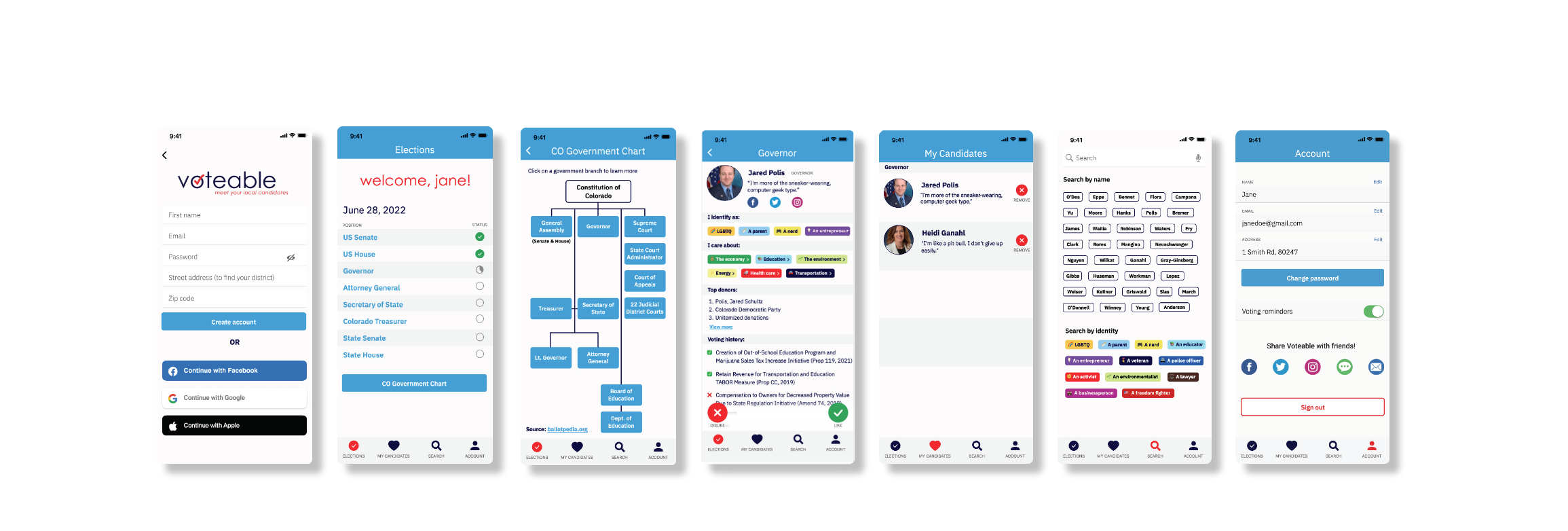
Voteable gives Coloradans the opportunity to learn about their local candidates by swiping through cited, succinct, and engaging candidate profile content, in addition to election information and government education.
Voteable allows voters to get to know their candidates as people, not just politicians.
**I designed and printed books of my entire process, to view the digital version on Issuu, click here.
The Problem
I found through my preliminary research (literature reviews & user interviews) some of the problems young voters may experience during the voting process.
They do not understand election language
They do not have time to do their own research
They do not trust a lot of information
The voting experience is not engaging
The Question
From this research, I formed my thesis question:
“How might the application of user experience design help educate young Coloradans about their local candidates?”
User Interviews
I interviewed five young individuals about their voting process and how they decided on who to vote for. I also asked what difficulties they experienced and what would make their process easier. Young people want to know who their candidate is as a person, not just as a politician. They care about who they are, motivations, community involvement, voting history. I kept out party affiliation and partisan language to bring more humanity to candidates. Here are some quotes from my interviews:
“I only look at the top three results & make my decision from there.”
“If I don’t have time, I will just vote democrat.”
“I give my ballot to someone I trust, like my mom.”
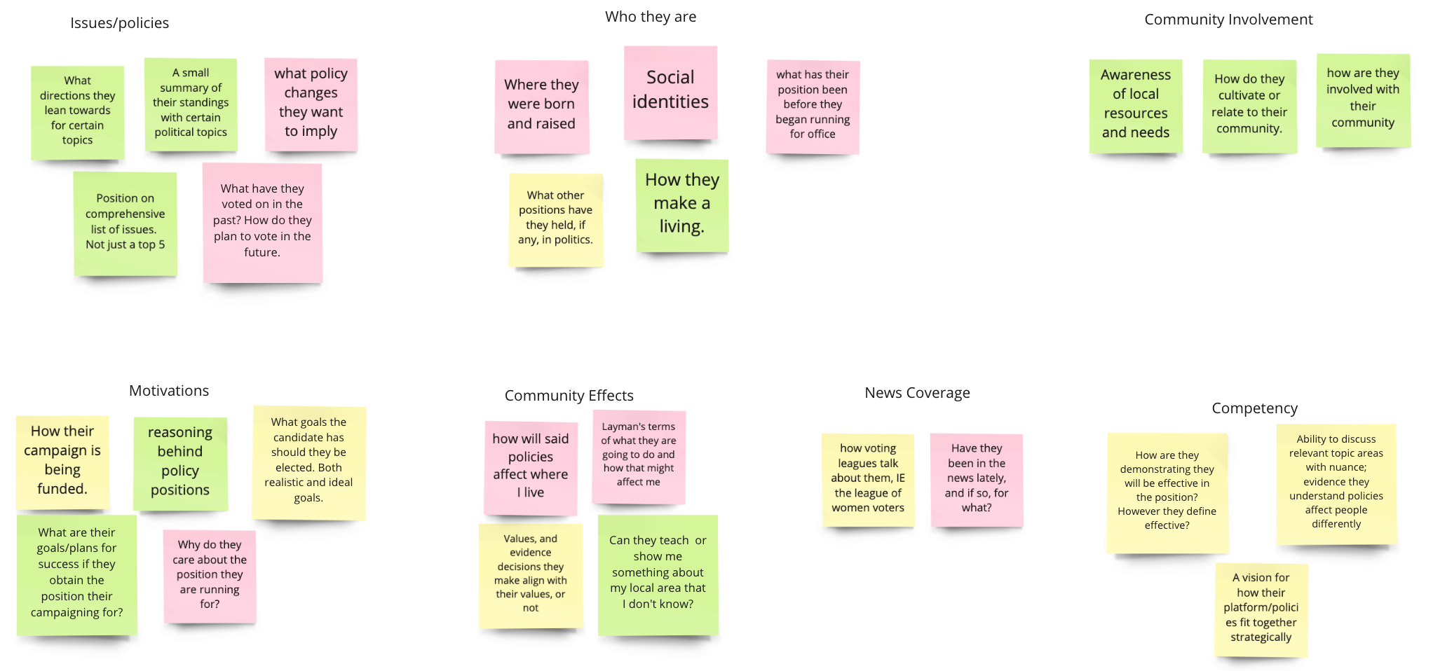
I hosted a focus group session online with seven team members from the CMTC. On Miro, I asked them to write down what they want to know about their local candidates before casting their ballot. From here, I performed affinity analysis on their stickies and grouped them into categories. These answers helped me build what would be on candidate profiles. There was an open group discussion afterwards where I got additional valuable insights. Some group members mentioned they wanted to see their candidates humanized and get to know who they really are. Some other members mentioned they don’t like how candidates and issues are black and white. Such as democrat/republican or mask/no mask.
Miro Affinity Analysis
Competitive Analysis
I wanted to see if there were any apps out there that were similar to my idea. From analyzing the following two apps, I had positive experiences that inspired my app, and negative experiences that I tried to avoid.
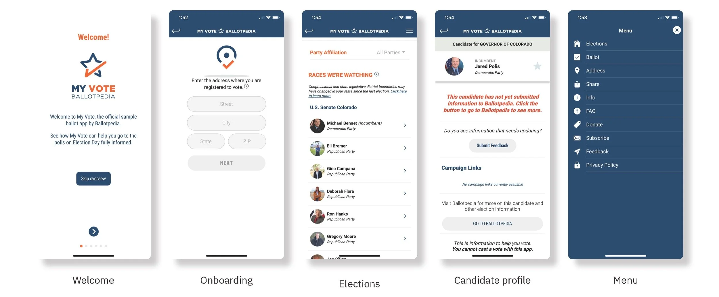
The first app I researched was Ballotpedia’s “My Vote” app. Overall, the app was intuitive and simple. There was never an overload of content and the interface is clean. There was an introduction of how to use the app before signing up. This was useful to give an overview of the app before committing to signing up. When I saw the app asked for my address I was hesitant to give it and wanted an explanation of why it was needed. Then I saw my upcoming elections and list of candidates. However, when I clicked on a candidate, there was no information in the app and you had to click an external link to access Ballotpedia itself. This was not useful, keeping information inside of the app is much easier than having to switch apps. I also thought that the menu was a bit extensive and some selections could have been combined.
“My Vote” screenshots
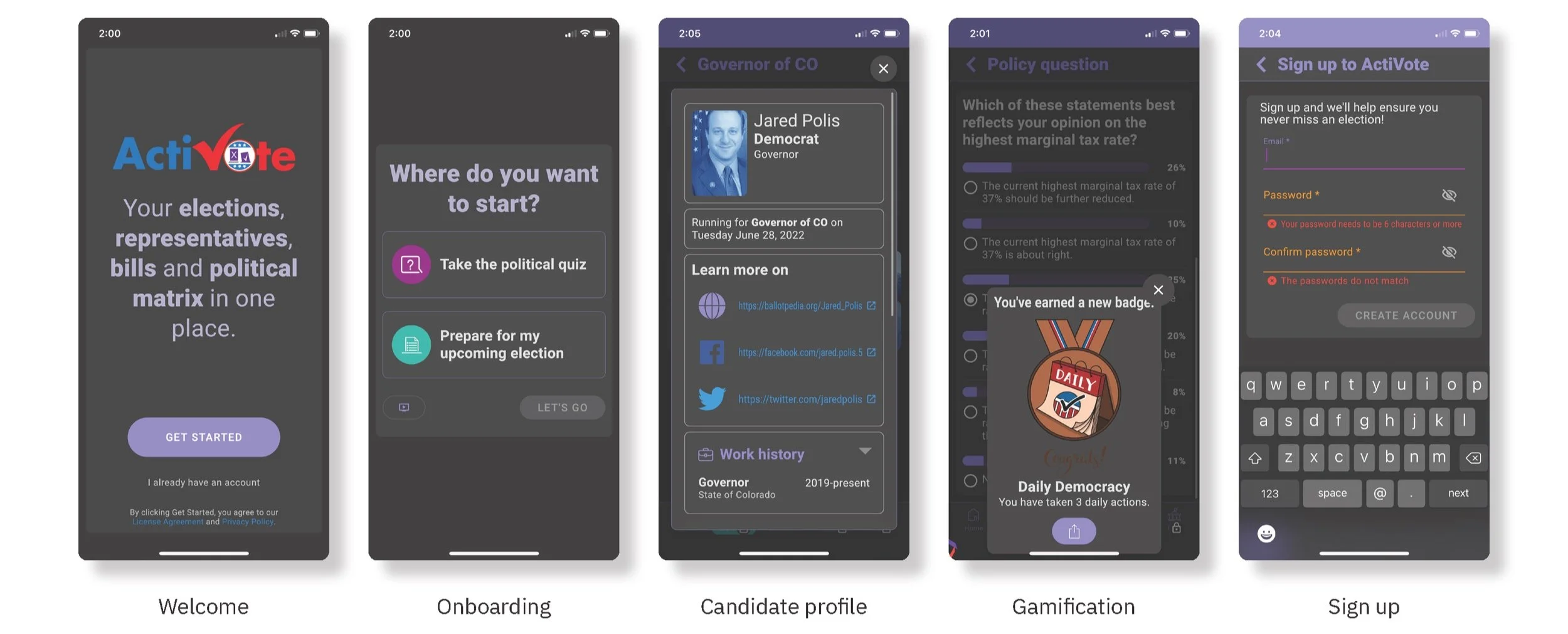
The other app I researched is called “ActiVote.” Overall, this app felt overwhelming, due to the interface and amount of content. The interface seemed to have text and images that were too large and a color theme that did not make sense and was hard to read. The welcome screen had a description of the app and then asked if you wanted to take a quiz or prepare for an upcoming election. I chose to take a quiz and then explored the app. The quiz asked questions that would help place me on a political matrix, which would be compared to candidates. When I explored information about candidates, it showed their socials and work history. A nice feature was gamification of earning badges and upping your status. I liked that I could use this app without making an account, I still had to enter my address to see my elections though.
“ActiVote” Screenshots
Personas
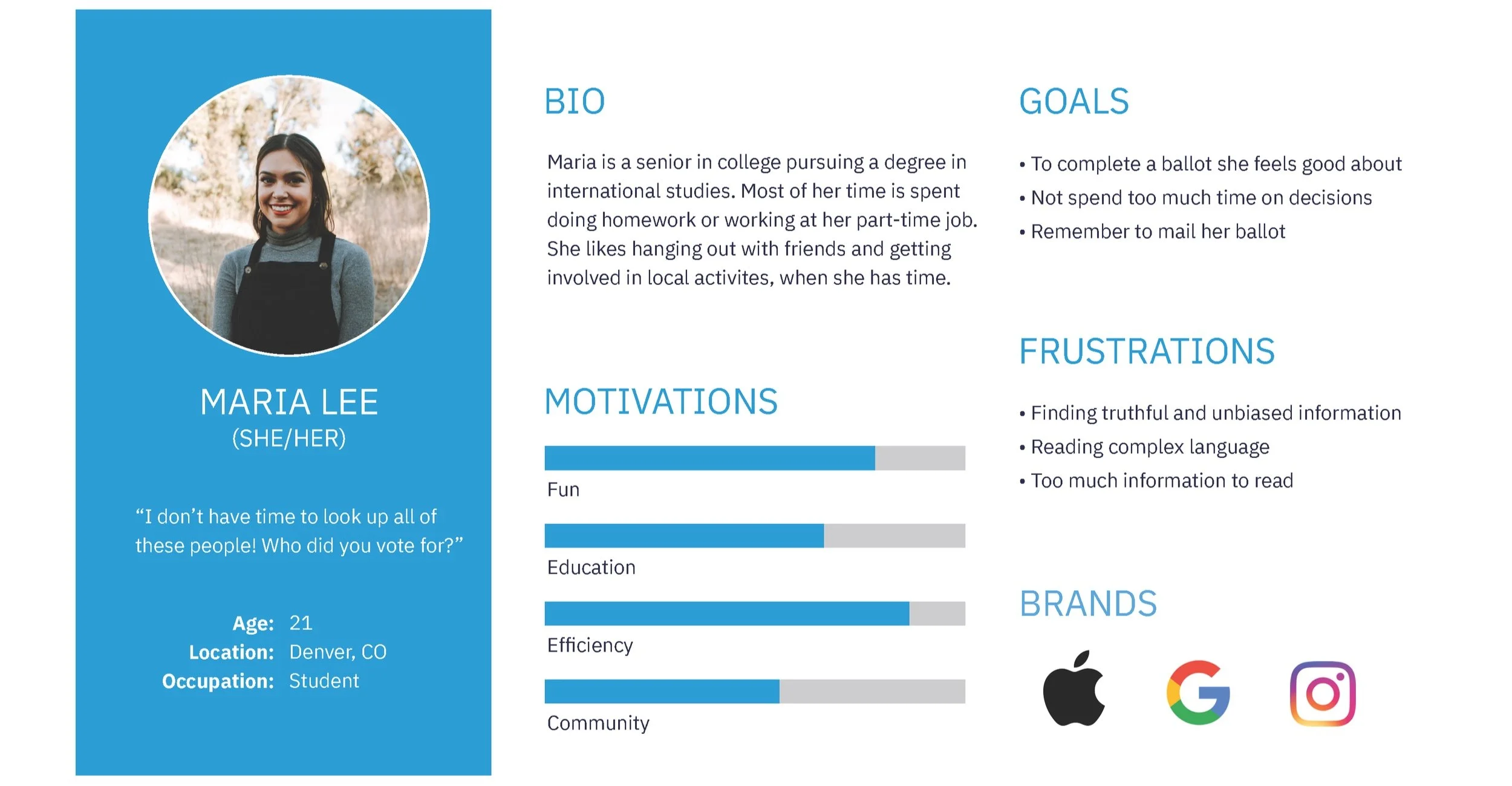
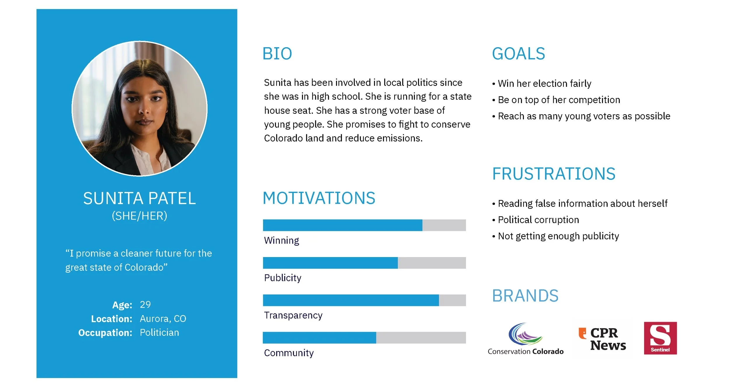
Based on my user research, I developed a voter persona to define my target user. This helped me identify their motivations, goals, and frustrations. These user needs and pain points were continuously referred to as I progressed with my app development.
In addition to my target market persona, I made a candidate persona. I felt this would be another user of the app who would be curious about their competition. Even though my app was not created for politicians, it is beneficial to identify with all users and see how they would interact with the app as well.
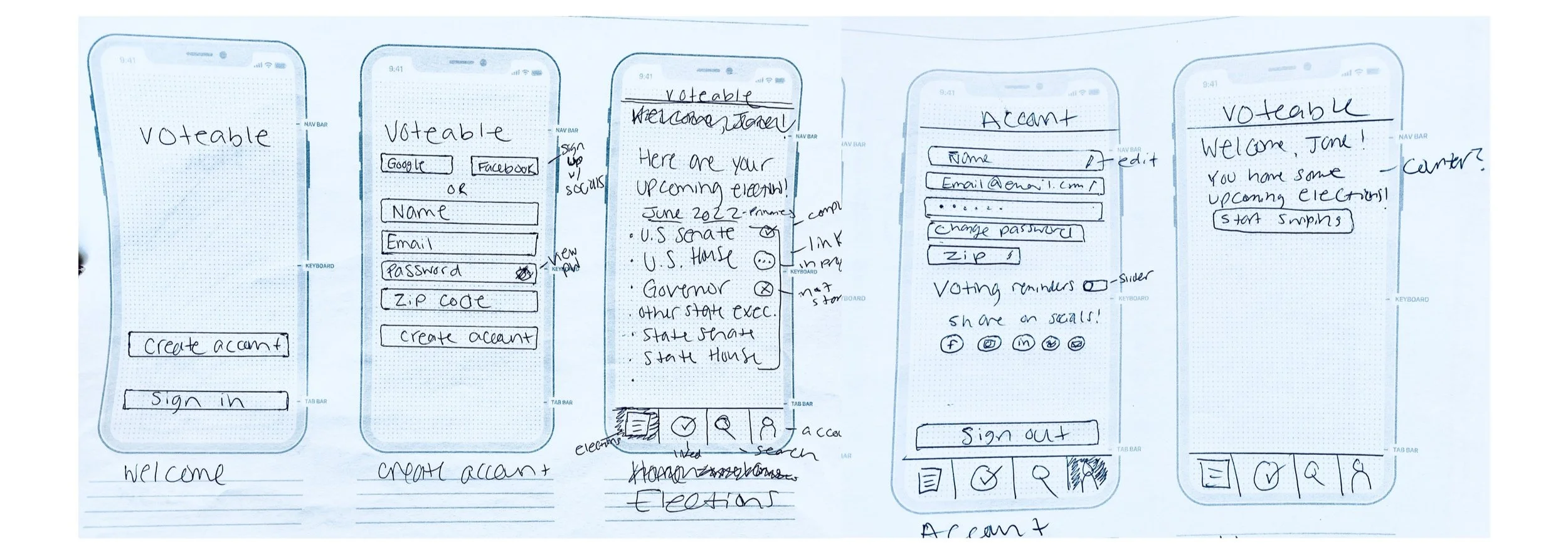
Low Fidelity Wireframes
I created low fidelity wireframes to illustrate my layout on paper templates. This helped me visualize where to put all of my elements and how to begin envisioning the flow of the app.
Lofi wireframes
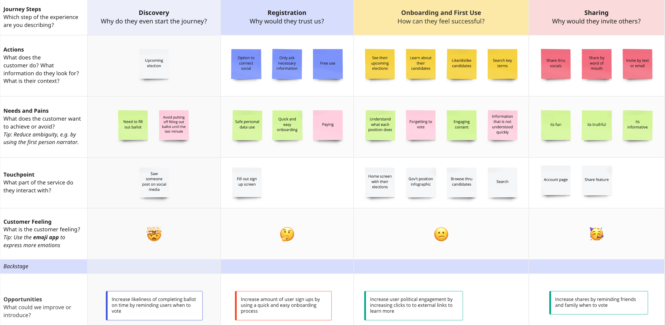
User Journey Map
I used this journey map template in Miro to walk through how my user would interact with my app. This forced me to think about their needs and pain points at each step. It also forced me to think about a lot of why’s. Why would they use the app in the first place? Why would they trust my app? Why would they share it with others? From here, I formed success metrics that would define how to continue improving and testing my app.
Journey map
Success metrics:
Increase likeliness of completing ballot on time by reminding users when to vote
Increase amount of user sign ups by using a quick and easy onboarding process
Increase user political engagement by clicking on external links to learn more
Increase shares by reminding friends and family when to vote
Moderated User Testing
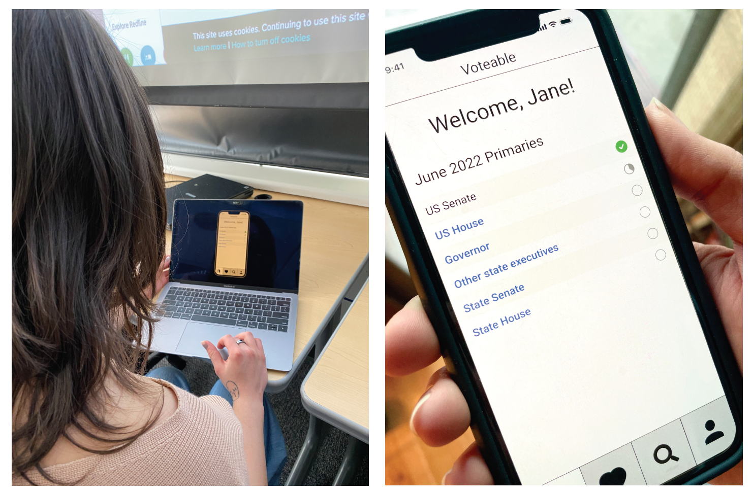
I tested my medium fidelity prototype with four users to test content and flow, without styling being a distraction. Some feedback I received from my users was to provide a visual for how the government works together and what each position does.
Another piece of feedback I received was to change the search page to something more interactive and to provide some specific examples of search terms. Someone suggested I add the exact date of the election so users don’t forget to vote. A styling issue I discovered is that my tab bar was too large and I could fit more content if I reduced the size.
Photos of user testing
Style Guide
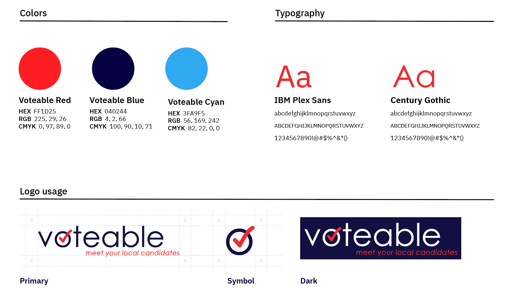
Voteable’s style uses the typical red and blue political colors. I wanted to do something different initially, but the colors communicate to the user what the app is about. I used sans serif typefaces for a more modern, youthful, and clean aesthetic.
Style Guide
High Fidelity Prototype
I made a shareable Figma prototype for users to access.
Unmoderated Testing
I sent a Google Form that was completed by fifteen participants. The survey asked that the user open my prototype in Figma on their mobile device while answering questions on their desktop. I asked demographic questions, such as age and occupation. I asked for open ended answers for their thoughts on each feature. Lastly, I asked if they would continue to use and app and if they would recommend the app. Some easy fixes were implemented from this feedback, such as adding more informative text and symbols and adding current government roles to profiles.
Quantitative Results
15/15 participants would recommend Voteable
14/15 participants said Voteable would make voting easier for them
15/15 participants described their overall experience as positive
12/15 participants would continue using Voteable
Qualitative Results
“I appreciate the simplicity of it, very clear and not overwhelming, everything also appears to be accessible.”
“I think it creates a more human experience, and helps make learning about candidates easier.”
“I love that this is a one-stop shop to understand and learn about candidates.”
“This is great for those who don’t know a whole lot about gov/voting.”
Retrospective
Overall, I think my project and process went well. I knew I wanted to focus on local voting from the beginning and that helped me get started early. I stayed on top of my work and met my deadlines. I had multiple strong SME’s (Subject Matter Experts) and DME’s (Design Matter Experts), which helped me along the way. I feel strongly about the topic so I enjoyed working on my project and I am passionate about it. I believe I present thorough research to show how design decisions were made in my prototype. The user feedback I received made this product much better than I imagined. I am happy with the final product and I can say that others are too.
I think I could have gone more in depth with my user interviews. I was more casual and I could have made it more formal and direct to get some more insights. I also think I could have had more participants in all of my user testing for more feedback. I could have spent more time to present a more UI design system as well. The good news is that these are all things that can be improved in the future.

