Data Visualization: Competency Results
This is a sub page for SEEE. For the overview of SEEE, please click here.
The Problem
Our team needed to build an interactive data visualization that would display the results of the competency questionnaire.
The Question
How might we allow SEEE portal users to understand competency data, individually and in relation to another's profile, at a glance?
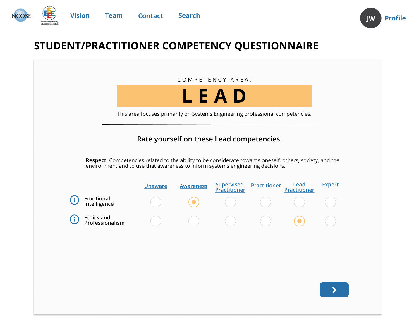
questionnaire example
Ideate
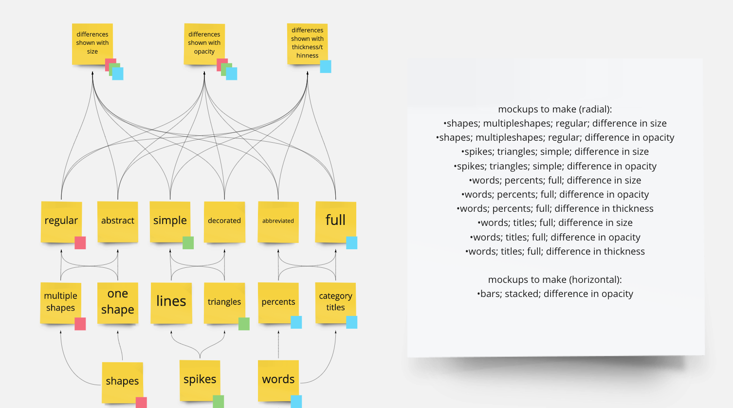
To do this, we started out by making a mind map in Miro. This allowed us to list out variations of visualization characteristics and come up with several combinations to mock up.
Mind map
Design
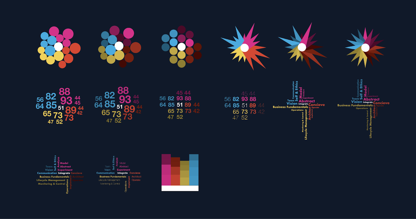
Next, with the help of a fellow designer, we mocked up several data visualization options to test with fake data.
data viz mock ups
data viz mock ups
Testing
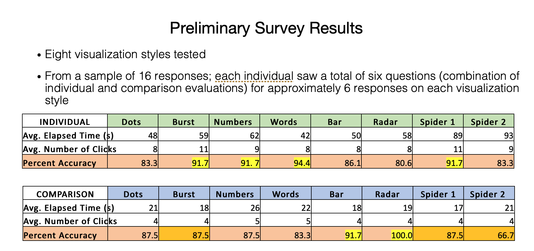
From here, we tested eight different charts in Qualtrics. We tested each chart individually and side-by-side with comparison data. We calculated the average elapsed time and number of clicks. We also calculated the percent of accuracy of each visualization question.
Survey results
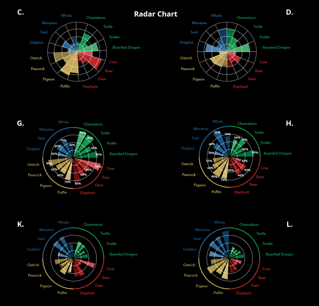
While the radar chart did not rank the highest of individual accuracy, it proved 100 percent accuracy for comparing data. Our stakeholders were also set on the design of the radar chart. We made several iterations of the radar chart before we landed on a final decision.
Iterate
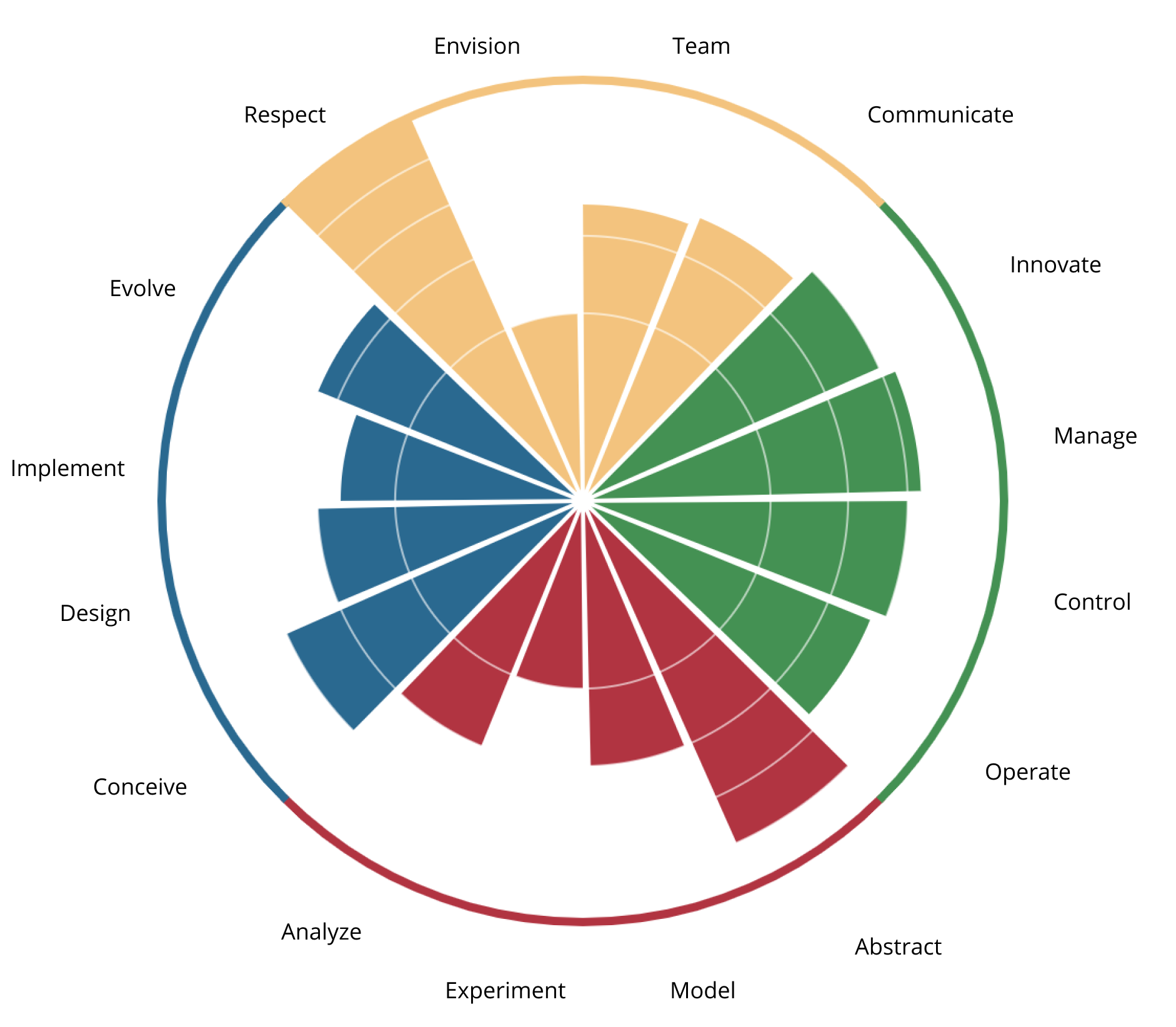
This is the final iteration of the radar chart. Each color represents one major group, while each bar represents a subgroup. The radial lines represent what level the bars are.
data viz
Interactive Design
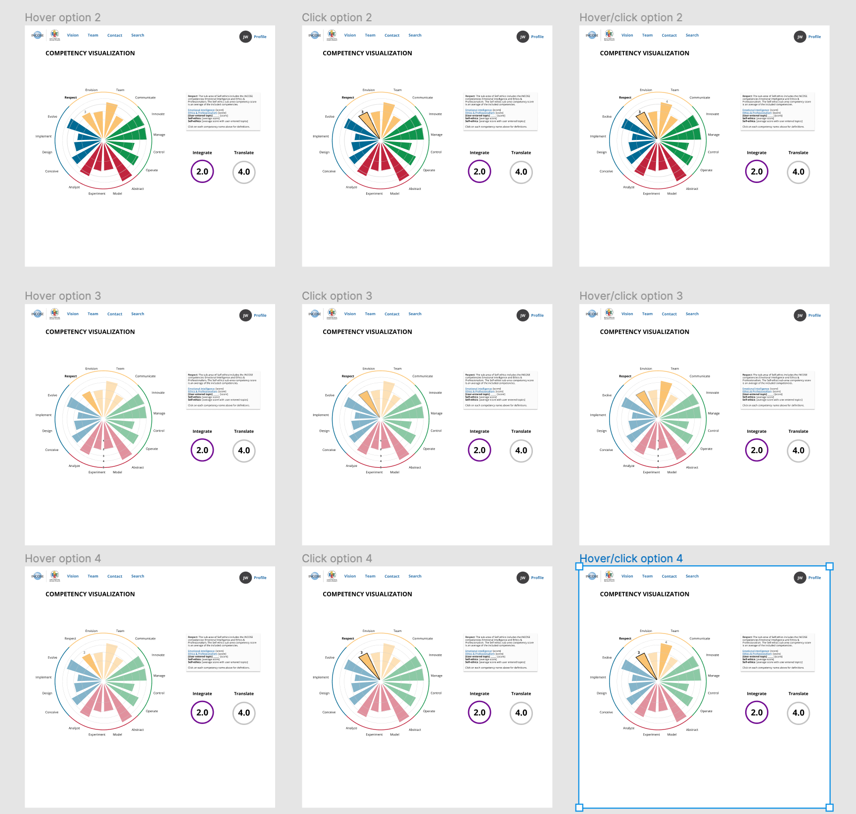
I came up with several mock ups and iterations of how the user would interact with the data visualization in Figma. We decided on Hover Option 4. The name of the competency group’s name and bar would be bolded/outlined while the rest of the chart reduced in opacity. The competency level would appear on top of the bar when clicked. If you hovered off of the clicked bar to another, the bar would increase to full opacity and its level would appear.
This option was decided amongst our team members to be the easiest to understand the chart’s data.
data viz interaction options
Implementation
When it was time for the developers to make this visualization into a widget, this is what it looked like:
data viz widget

