Rebranding a local theater event.
For this class project, I was asked to make a package for an existing theater event and design a website, animated social media bumper, and a poster. I chose David Byrne’s immersive experience, Theater of the Mind, which was supposed to come to Denver in summer 2020.
Project Overview
This project exhibits the core understandings where typography and other visual imagery are used together to cohesively create a set of well designed, thoughtful, logical and relevant promotional, marketing and interactive media. The final deliverables use its main source of typographical solutions throughout. Although type is the dominant visual component within the visual solutions, it is used effectively with imagery as well. The text based content is reused from the original event.
About Theater of the Mind
Inspired by both historical and current lab research, Theater of the Mind takes you on an immersive journey inside how we see and create our worlds. Co-created by Talking Heads frontman and artist David Byrne and writer Mala Gaonkar, the show uses stories from their own lives to shape a narrative you’ll see, feel, taste and hear.
Witness the wonders of your mind for yourself as you follow The Guide through a spectacular 15,000-square-foot installation with 16 fellow audience members. As you explore intriguing environments, participate in a narrative and try a series of sensory experiments, your Guide will question how beliefs, memories and even our identities are less fixed than we think.
Caution: the brain may wander. Side effects may include a distrust of your own senses, a disorientation of self, and a mild to severely good time. You may not be who you think you are. But we’re all in it together.
About the Experience. (n.d.). Theater of the Mind Denver. https://theateroftheminddenver.com
Project Brief
Target Audience
Adults with open minds
Marketing Strategy
Use of vague, vibrant, obscure graphics/body copy/typography to intrigue guests for a once in a lifetime experience.
Competition
Meow Wolf, immersive theater
Potential Challenges
Guests may not attend due to fear of the unknown.
Proposal Summary
Theater of the Mind will be an immersive sensory theater experience. It is not clear what will exactly happen during this experience, but that is what is intriguing about it. Perception of reality will be altered. This inspires the design elements for advertising this show. Psychedelic colors, shapes, patterns, and type will all be used, suggesting an experimental good time.
Sketches
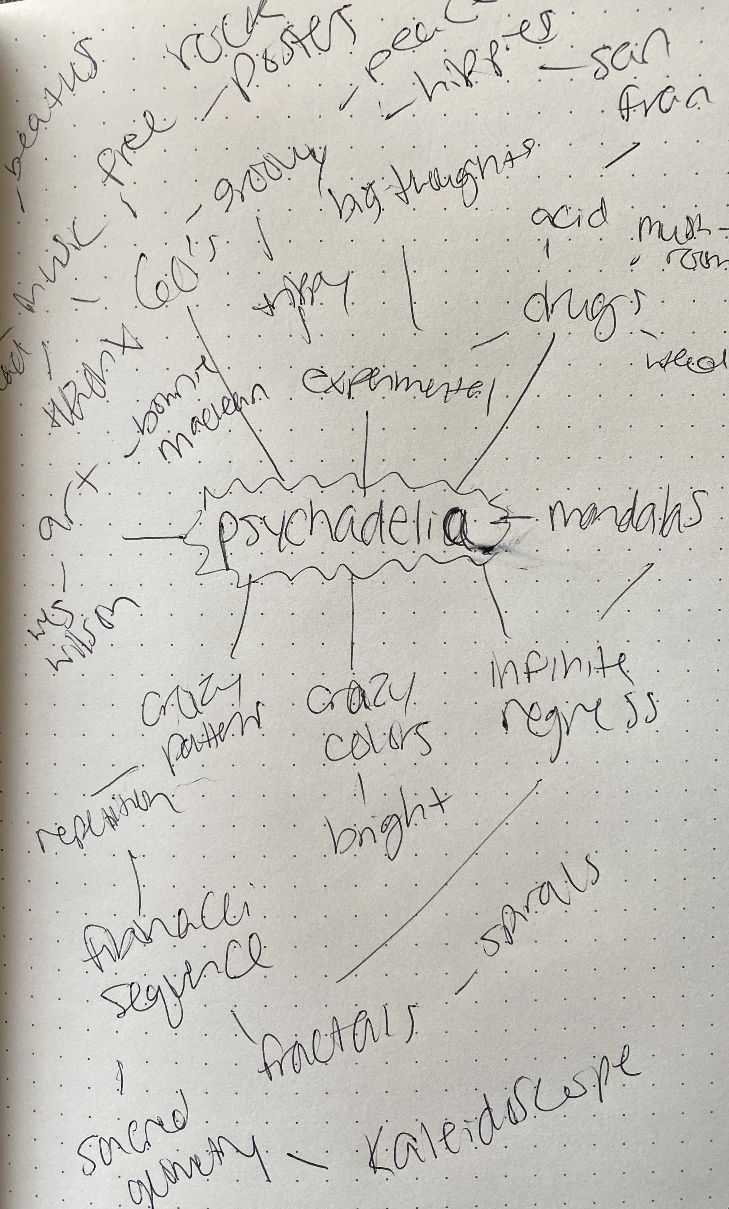
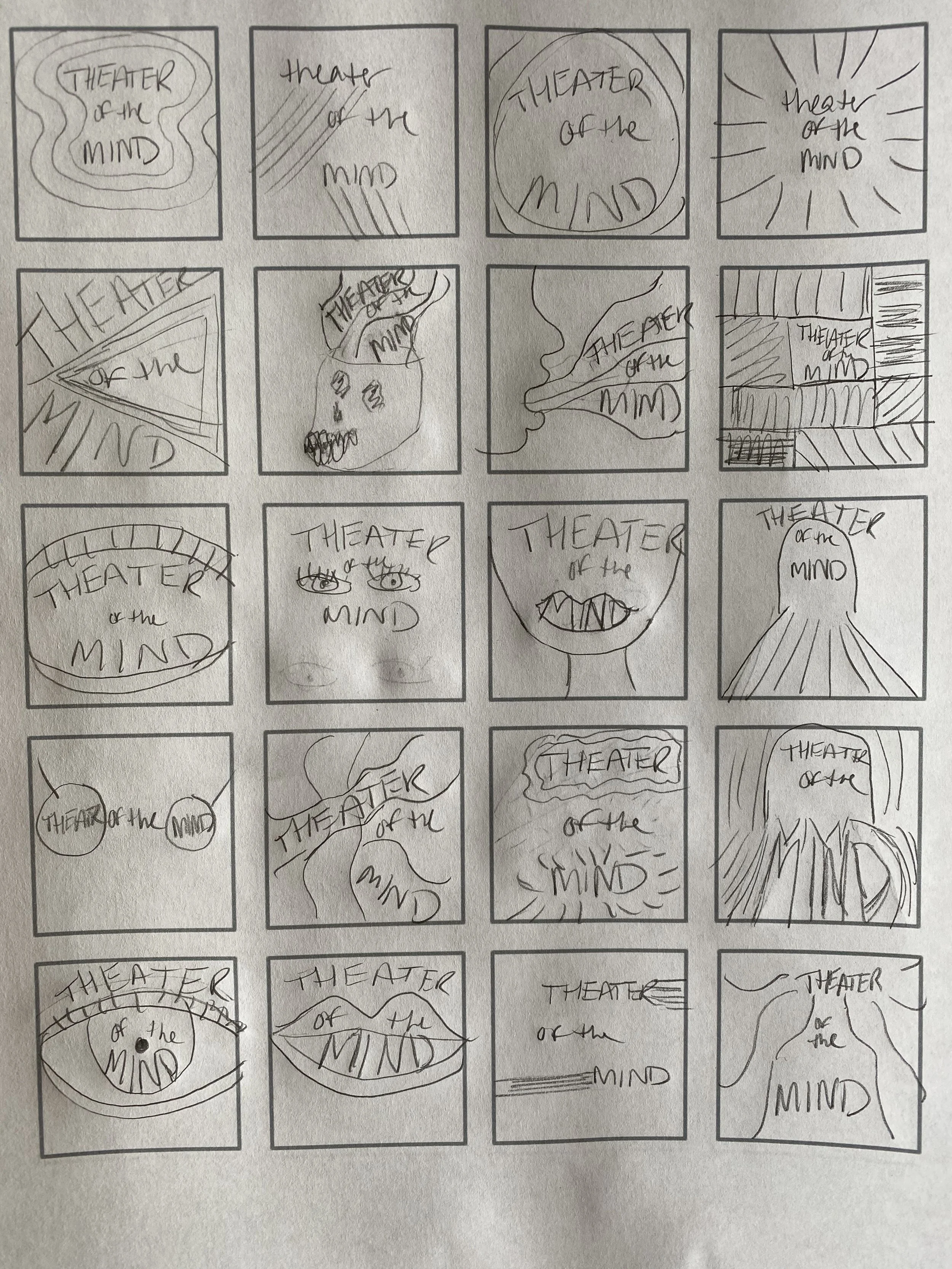
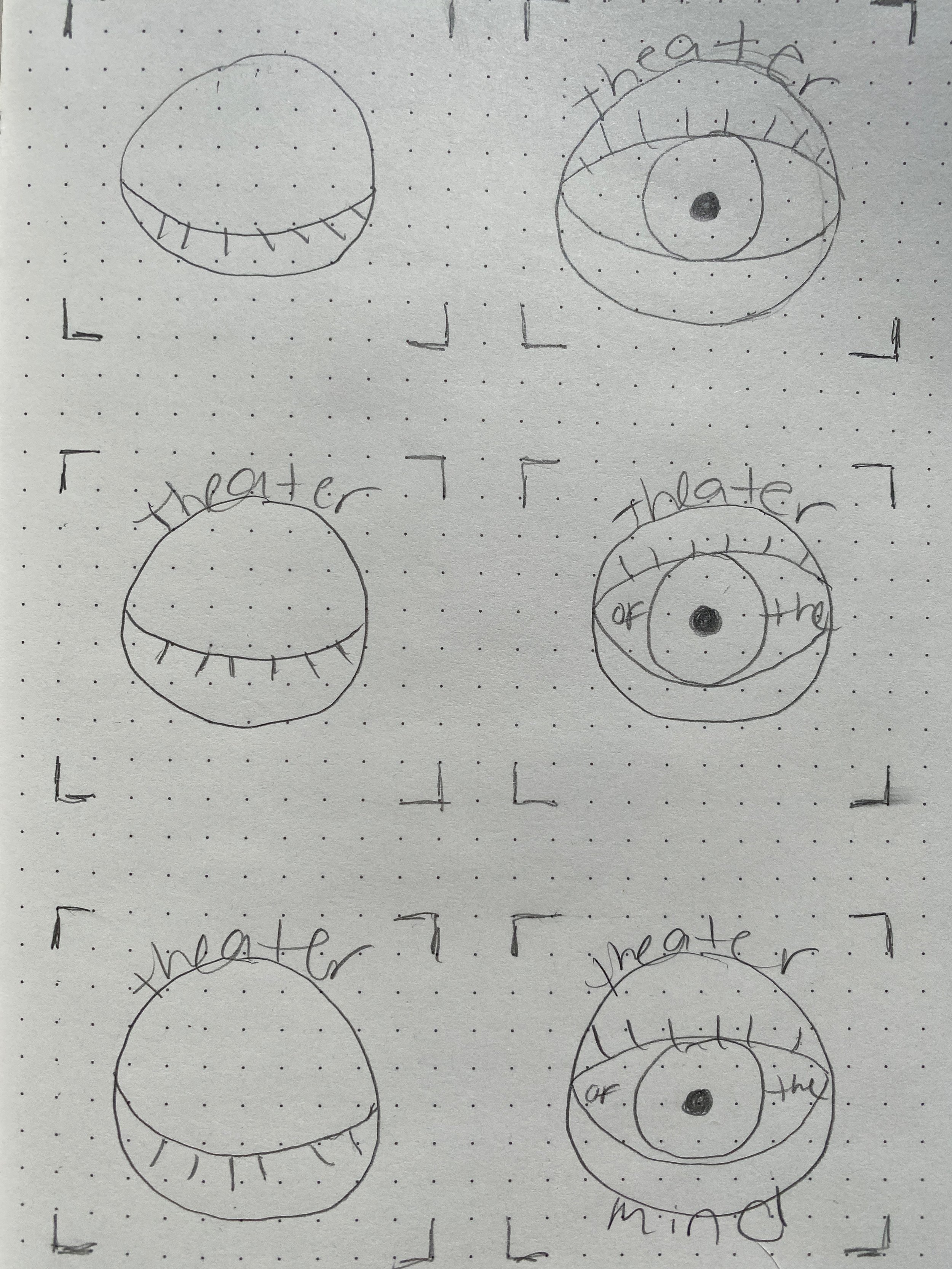
First, I created a word map to brainstorm on paper of what I wanted my design to look like. Then I made thumbnail sketches to visualize how I would combine text with imagery I came up with from my word map. The sketch on the right is how my frames would look for my social media bumper.
Poster Drafts
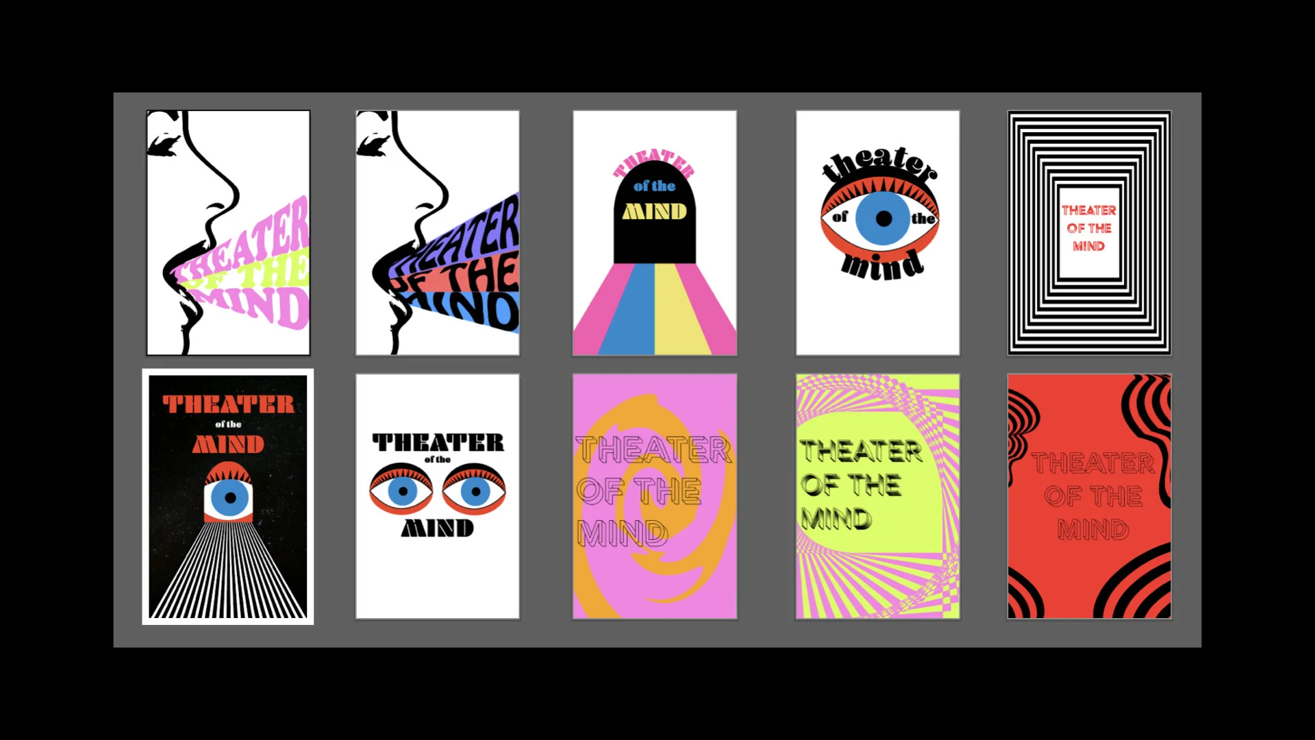
The designs I moved forward with were chosen with the help of my peers. I refined these in Illustrator and started playing with type faces and color usage.
Style Guide
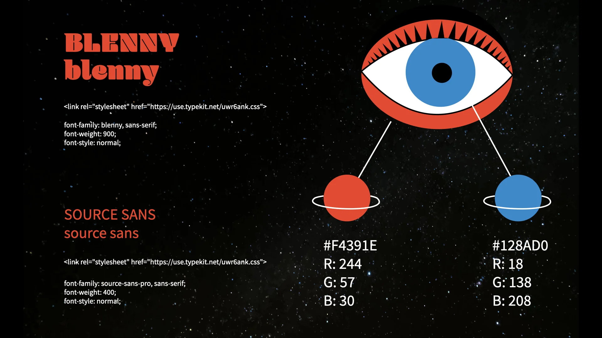
After final design decisions were made, I created a style guide with my chosen type, colors, and designs. There is also CSS code that I would use when creating my website.
Poster Final Draft
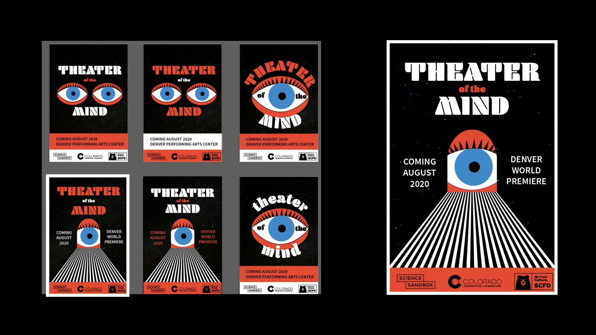
On the left you can see the final iterations of the chosen imagery and type, where I experimented with different positioning, sizing, and imagery. On the right is the final poster design. This design felt the most intriguing, as you are lead from the bottom of the poster to look at the eye through a door. The type feels balanced on both sides of the door and the title is boldly standing out against the black.
Website
I customized a website template for this project. I utilized my style guide to edit the type and colors. I built the navigation bar, added my own design to the splash page, added the creators of the event, and added a footer.
Social Media Bumper
This bumper was made in After Effects and was sized to be used on Instagram. The quick animations of the eye are meant to make the user stop scrolling and read the post as the words populate.
Retrospective
Overall, I am pleased with how my branding package turned out. There is cohesiveness across all three deliverables. The eye, colors, and typeface are all used effectively in the poster, website, and bumper. I believe the solution attracts the audience that would be interested in this type of theater experience. If I was given the opportunity to work further on this project, I would change some things. I would refine the animation of my bumper, it could be smoother. I would also take more time to add more content to my website page and scale down the type sizes.

