Reimagining an existing conference.
For this class project, I was asked to rebrand a creative conference and create many pieces for it, both digital and print. I chose the theme of sustainability for AIGA.
Project Overview
For this assignment, I designed an assortment of typographic materials promoting a major design conference. I developed my own aesthetic that complemented the existing brand, and then translated my creative concept across a wide variety of branded collateral for both print and online.
Typographic principles of hierarchy, composition, cohesion, grid and typesetting was paramount. This assignment also incorporated content management, information design, and resizing/repurposing across various deliverables.
This assignment emphasized how content dictates form, and form follows function.
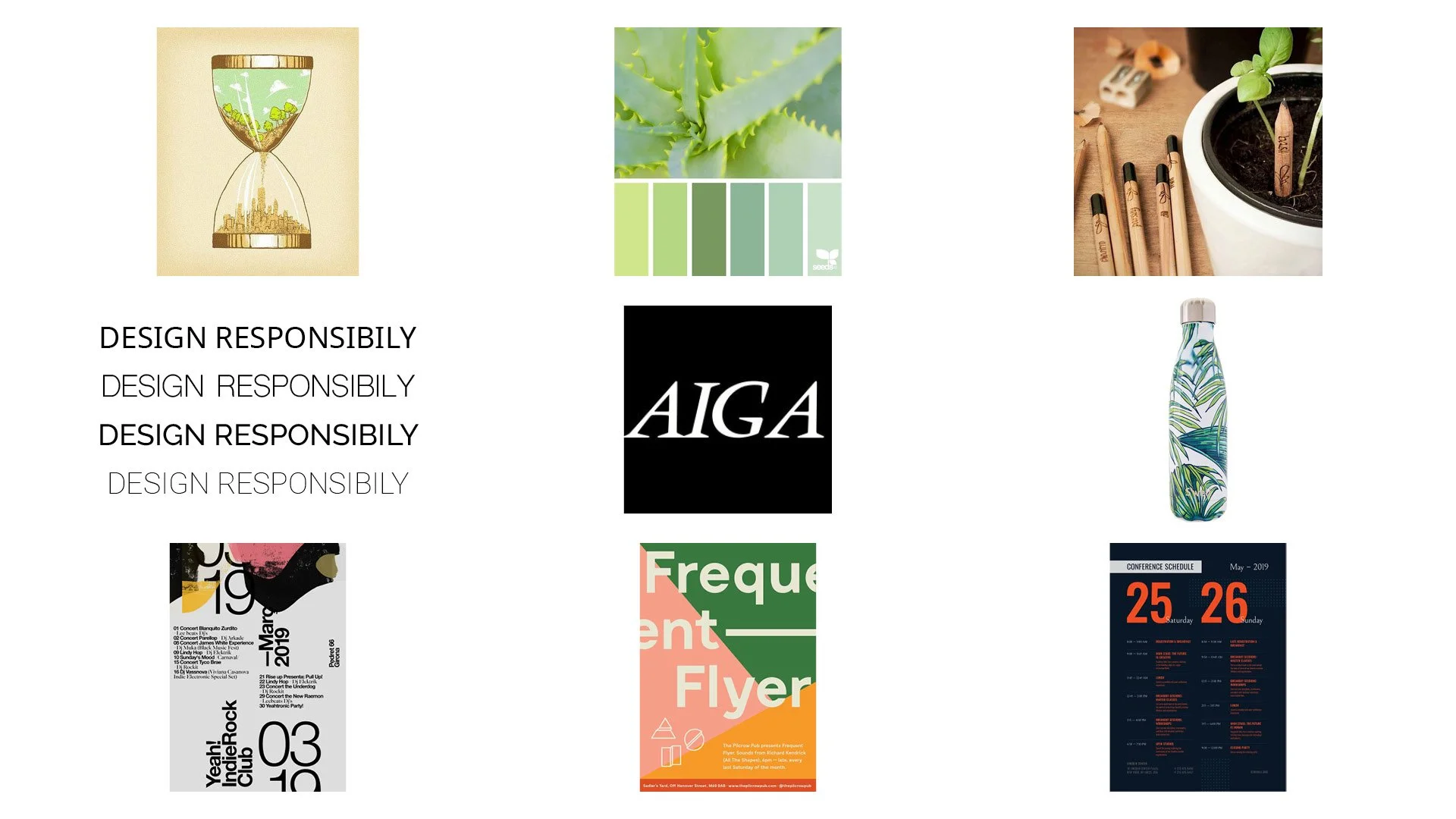
Moodboard
First, I looked for inspiration that would convey the feeling of sustainability. One look included earth-like tones with plant inspired illustrations. I also searched for typography inspiration that felt natural, organic, and non-distracting. Only using sans-serif typography, but also using uppercase in large text to give a sense of urgency.
Sketches
I took the inspiration I found and began sketching. These are the three top designs I chose, each have very different styles. The left uses red as the main color with diagonal lines. Red was used to give a more urgent feel to the conference, as in time is running out to make big changes. The design in the center gives an earthy look and focuses on the action of recycling. The arrows are seen throughout the booklet. The right design uses blocks of different sizes with black and yellow to give a more modern and edgy look to the conference. Some type is rotated and the display of the dates are used a design rather than just text.
Organizational Map
Poster
The final designs for the conference uses elements from each of my top three sketches. You can see the use of diagonal lines, plants, earthy tones, rotated type, and the display of dates. The poster is split into three triangles of various sizes. The top right has the three dates of the conference and the text is transparent, giving it depth showing the succulent beneath it. The succulent has a white gradient on top so it does not distract the viewer from the text. The bottom triangle has the AIGA logo with the information about the conference in a sans-serif font. This poster was made in Illustrator and the mockup in Photoshop.
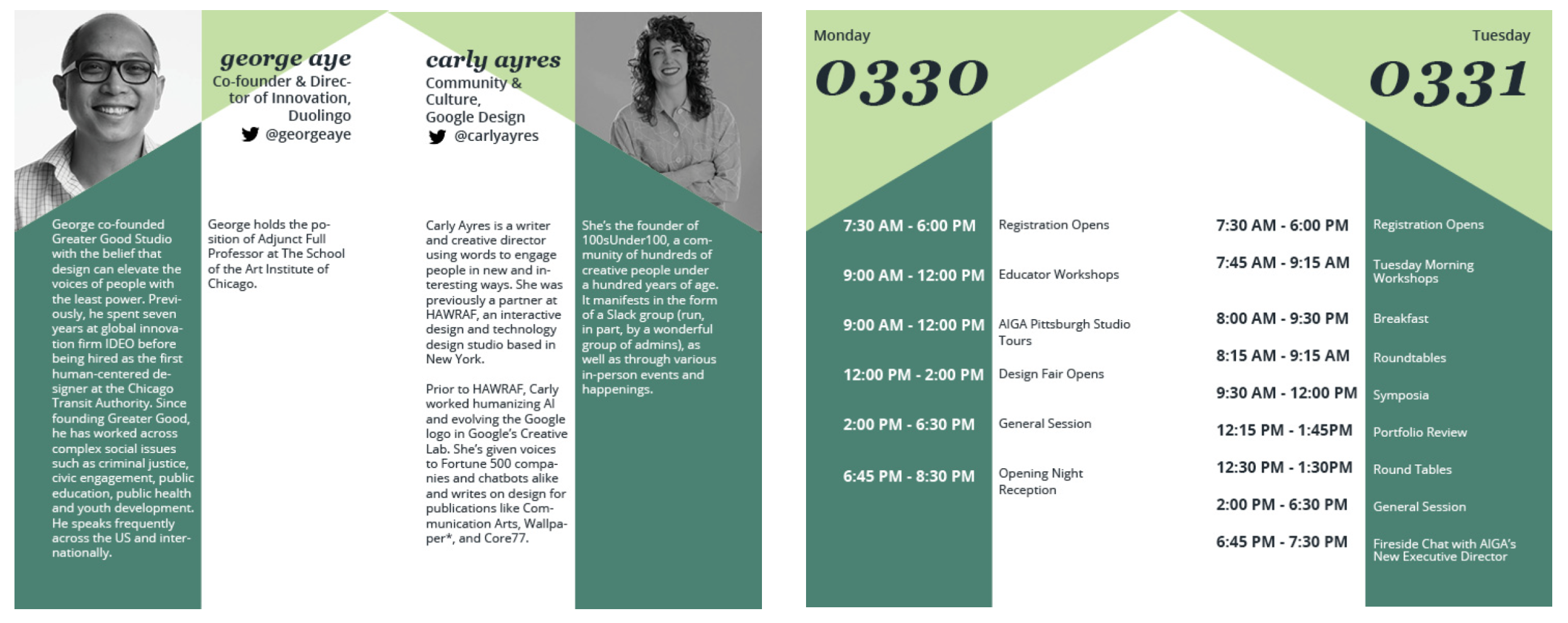
Conference Book Spreads
These are two spreads from the conference book I created in InDesign. The full book can be viewed on Issuu. The continuation of the use of triangles, earthy tones, and decorative text of dates are seen throughout.
Postcard
This postcard was designed in Illustrator and uses the same design elements in a slightly different way. For the front of the postcard, I used two different colors on top of the succulent, making it less of a focal point. “Join us” is in the same type style used for the dates, as this type is more of a design element rather than important information.
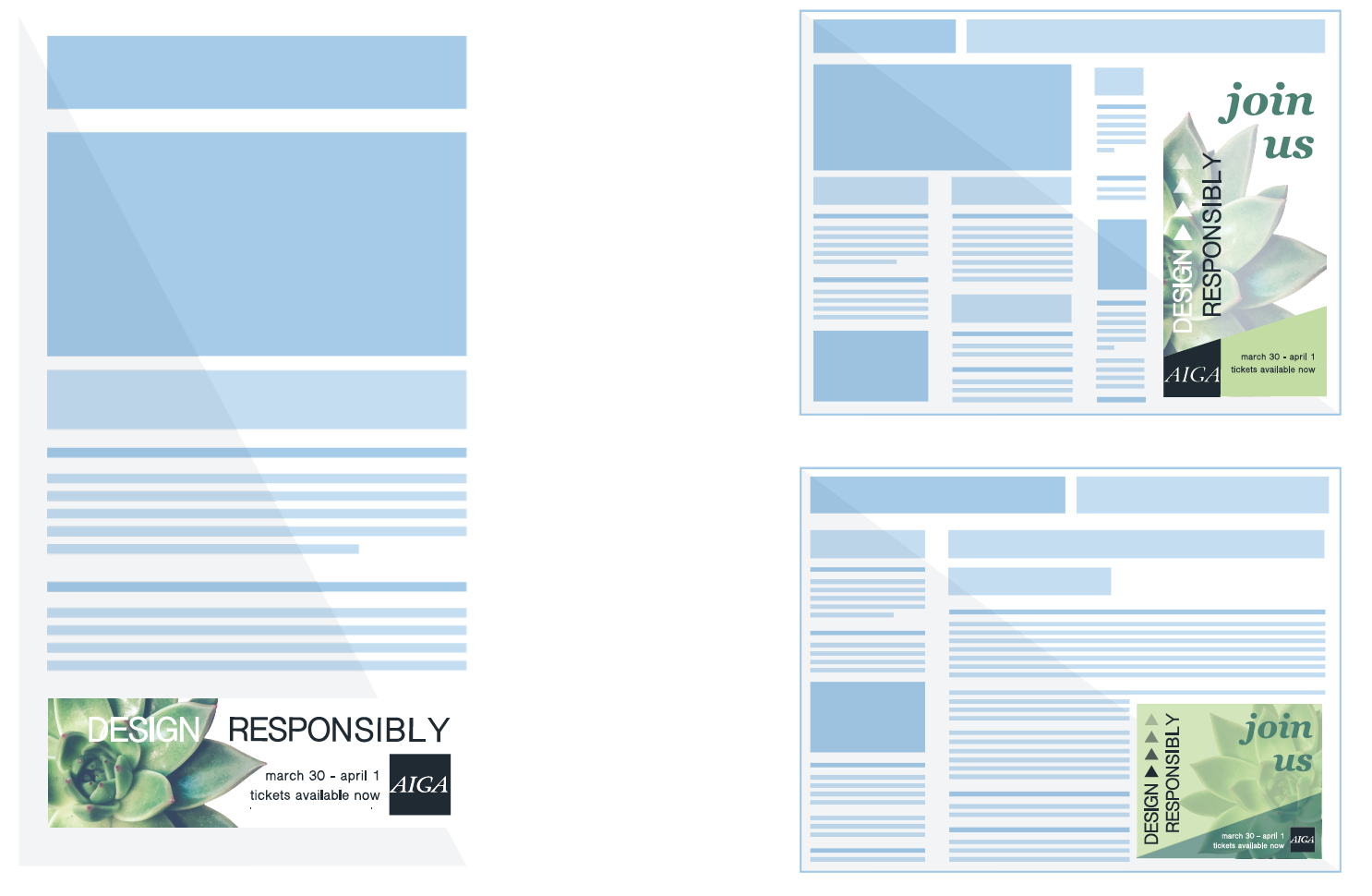
Digital Ads
These digital ads were created in Illustrator using Google AdSense mockups. Each online ad has different dimensions and I altered each individual design for its own size.
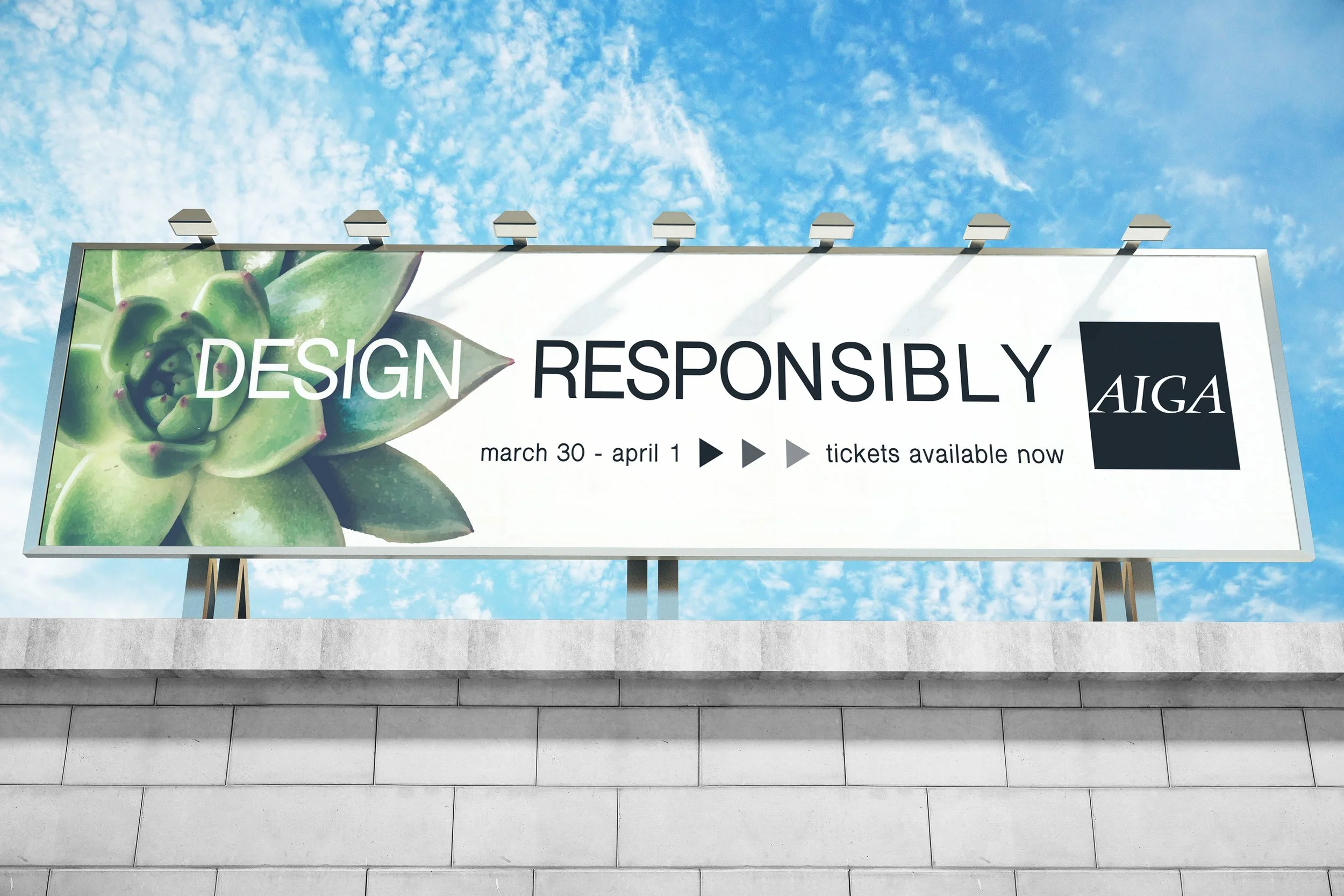
Billboard
The billboard features the minimal amount of information the viewer needs, as they may have a small window of time to see it. This is the conference’s name, organization, and dates. The succulent is also the design element that gives the viewer an idea of the feel of the conference. The billboard was created in Illustrator and mocked up in Photoshop.
Sign Up Form
The digital sign up form is for when the user purchases their tickets. These three mobile screens were made in Illustrator.
Giveaways
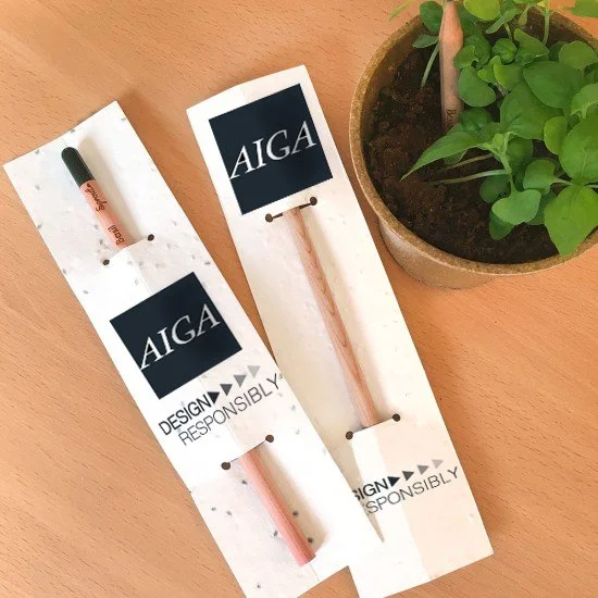
The two giveaways I chose for my conference were a reusable water bottle and plantable pencils. I used free mockups in Photoshop and added the appropriate branding.
Retrospective
Looking back on this project, it was a lot of work and included so many different parts. I am proud of how my overall design came out and I believe it portrays sustainability well. I like how I took parts from each of my sketches to combine into this brand for the conference. I think all of the elements make it unique without being too overwhelming. I would have put more time into the mockups to make them look more realistic. I would make some other small adjustments such as text spacing, alignment, sizing, etc. The most challenging part for me was using InDesign, I don’t think I used it for a project before.

