Create a COVID related mobile app.
As the sole UX Designer for my class project, I was asked to design an original COVID-related mobile app using the iOS design style and guidelines. I created a high fidelity prototype in Adobe XD.
Overview
When I was asked to create a COVID related app of my choice, this was a tough decision because there were so many people who needed help. I ultimately chose to focus on COVID long haulers, because it seemed like there were limited resources out there for them to connect and learn about their condition. My goal was to create this space for long haulers in a way that was the most beneficial and safe for them.
Proposal
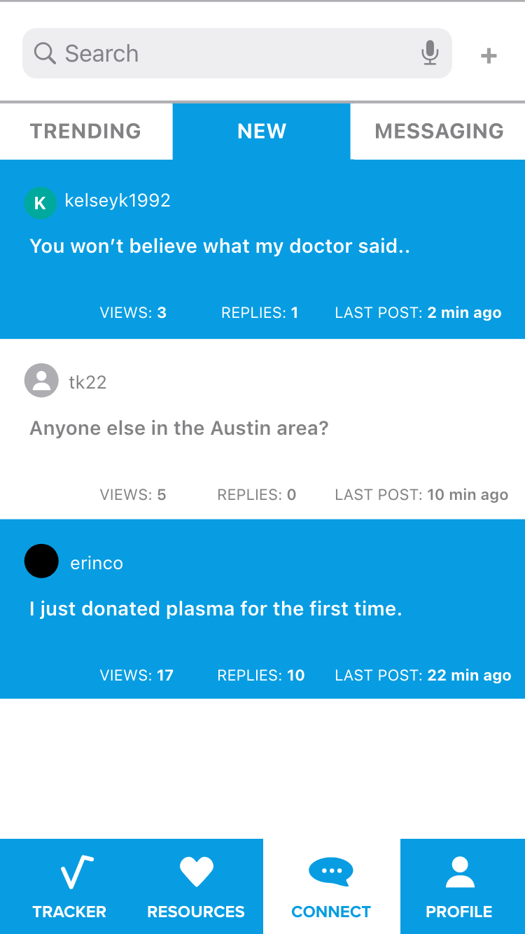
COVID-19 is still a novel virus, and the effects on each individual are different. Early on in the pandemic, a pervasive myth among patients and some health authorities was the idea that Covid-19 was a short-term illness (Goldberg, 2020). Only in recent months has more attention been given to long-haulers (Goldberg, 2020). Long haulers need support from one another because they are not receiving the help and care they need from their doctors. The U.S. is doing an “adequate job” of tracking infections, hospitalizations and deaths from the virus — but is not sufficiently tracking those who were sick with COVID-19 but never hospitalized (Young, 2020). My app will provide a space for COVID long-haulers to interact with one another, track their symptoms, and access resources.
Goldberg, E. (2020, September 7). For Long-Haulers, Covid-19 Takes a Toll on Mind as Well as Body. Retrieved from https://www.nytimes.com/2020/09/07/health/coronavirus-mental-health-long-hauler.html
Young, R (2020, September 10). ‘They’re Not Actually Getting Better,’ Says Founder Of COVID-19 Long-Haulers Support Group. Retrieved from https://www.wbur.org/hereandnow/2020/09/10/covid-19-survivor-corps
User Journey Flow Chart
I created a flow chart to help me visualize how a user would navigate CovidConnect from start to finish.
Competitive Analysis
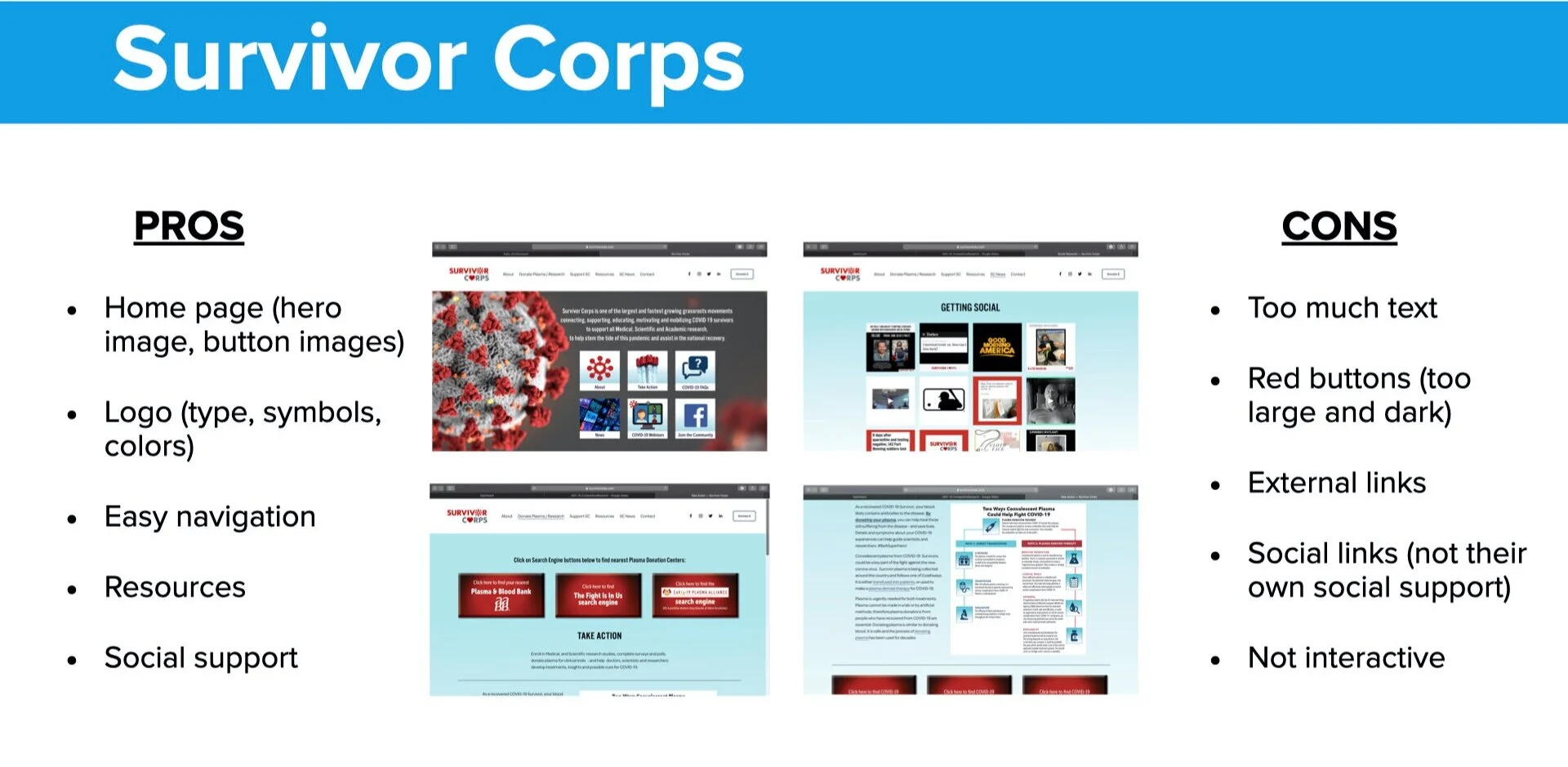
Since there was no app specifically made for long-haulers, I looked at a website, Survivor Corps. While the interface could use some improvements, I was able to get an idea of the kinds of resources that were helpful to long-haulers. However, these resources and the social aspect of it was all external. I wanted to limit the need to click out of the app. I also looked at a UK COVID app, which gave me some insight into some components and how they should be organized within the app.
Screen Designs
Usability Findings
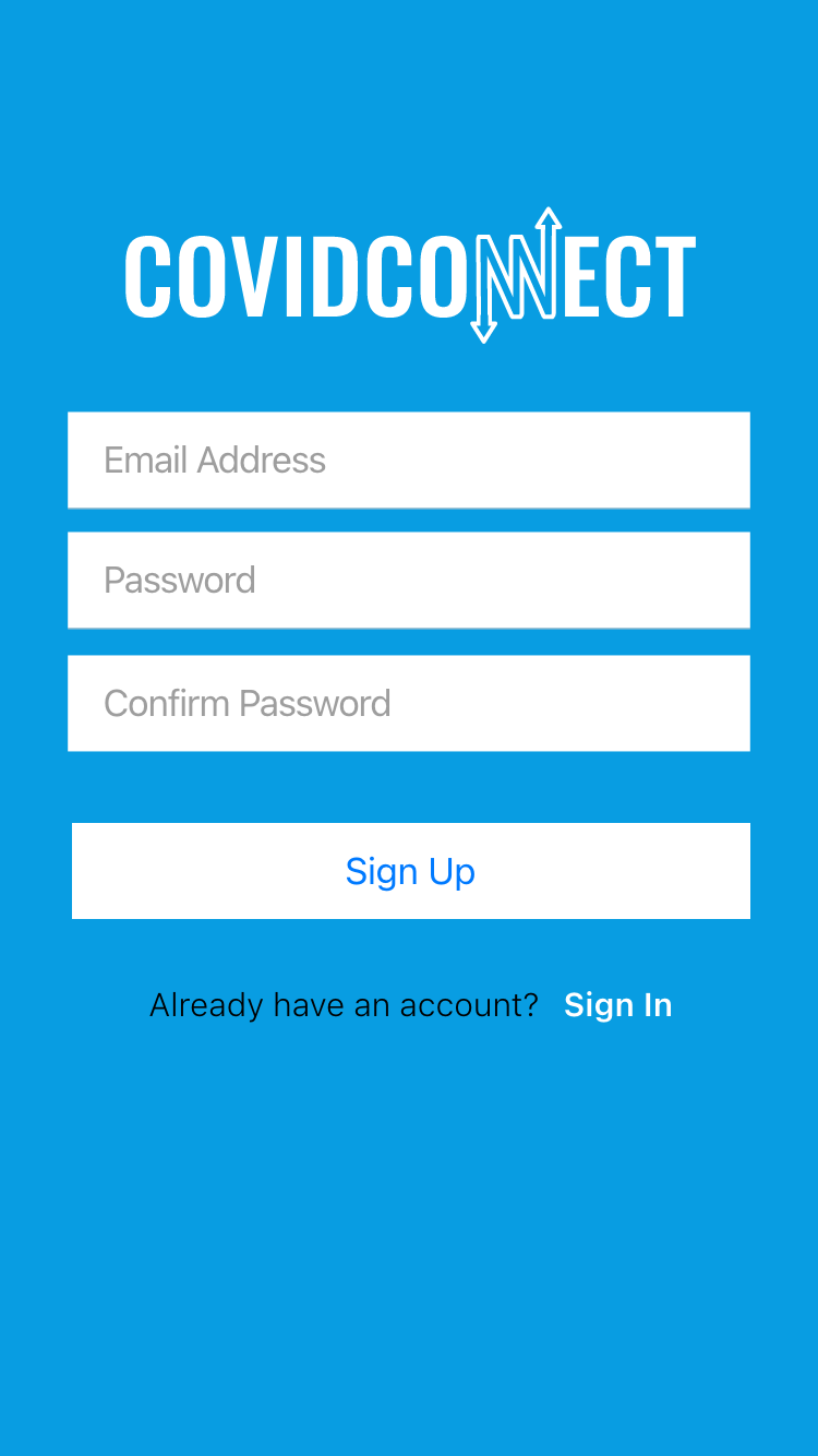
Four other students completed my unmoderated usability test. The assigned tasks were to make a profile, add symptoms, and access messages. These were all completed successfully. Every student complimented the app’s concept, clean design, color choices, easy navigation, and impressive wiring.
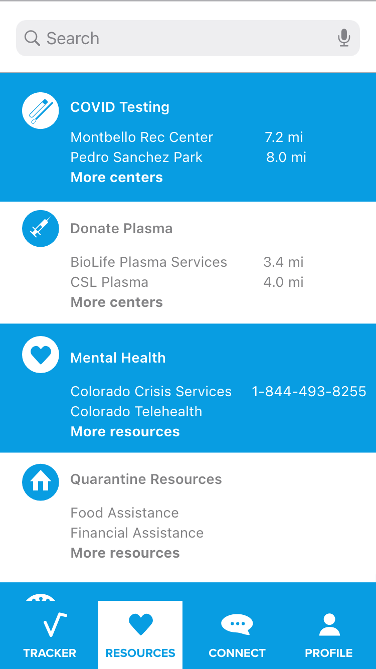
Some constructive feedback I received was to change the name of the tab “health” to “resources”, this caused some confusion. A student noticed that I did not have anywhere to create a new message or post in the “connect” section. I prioritized the suggestions that came from multiple students and suggestions I felt were important for the app’s functionality. I also asked students what screens they would like to see added. Based on the findings, I decided to add screens to “resources” and “connect”.
Retrospective
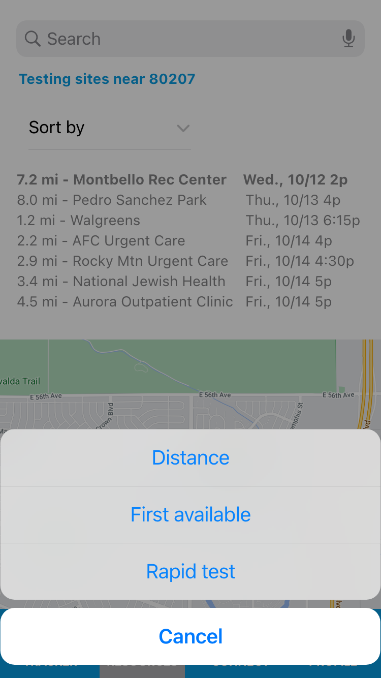
This was my very first user experience project. I think I did a good job overall. Looking back on this project, I did not use all of the correct Apple UI components and was styling them myself. I went back and changed these afterwards. On the other hand, I felt like I was almost too ambitious with the amount of screens and features I added on my prototype. Some were unnecessary, like adding Apple keyboards for logging in. I also changed my search UI, which was too simple before as just a card. I made a new screen for it and added a map and filters.


