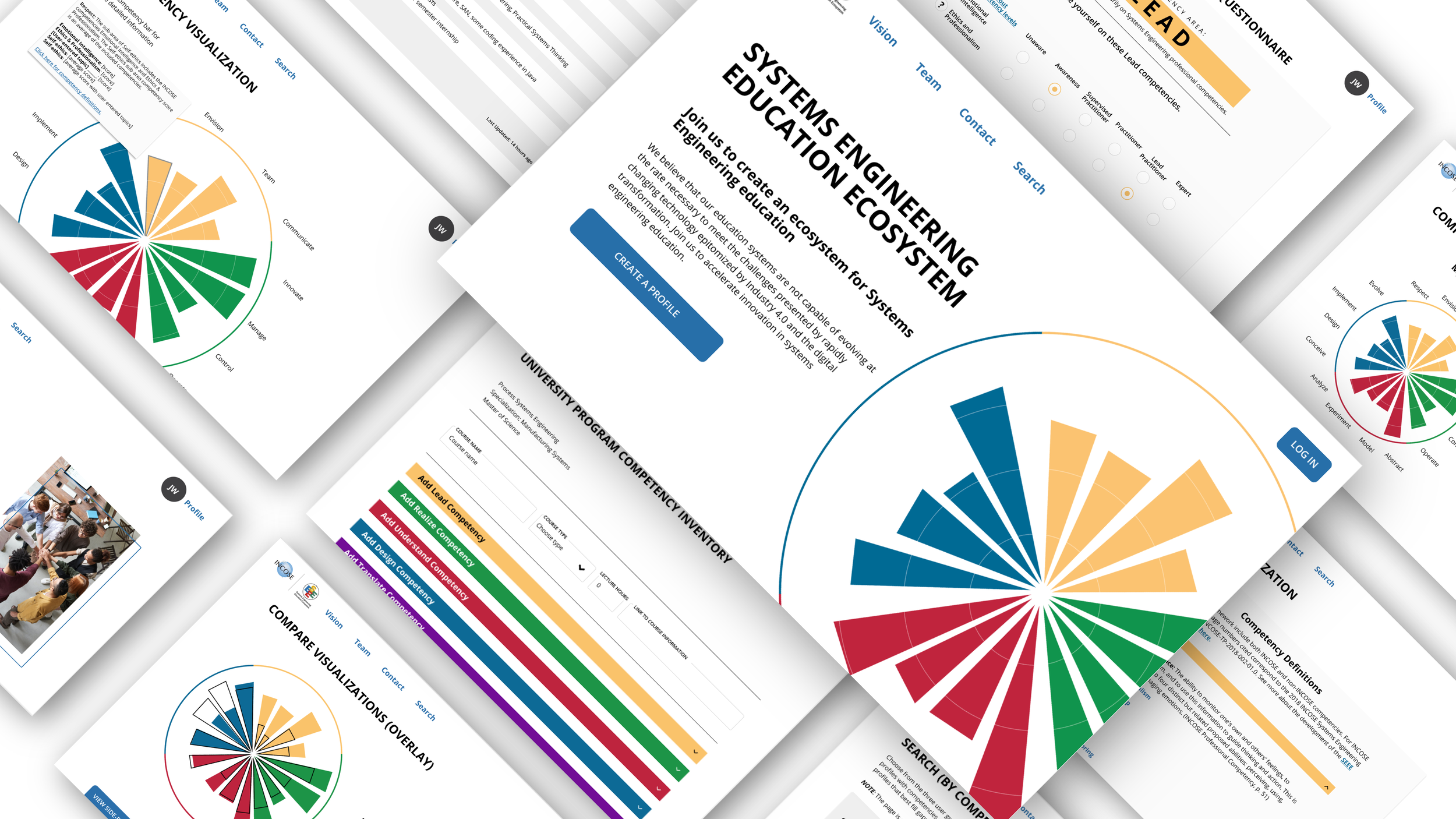
Develop a collaborative ecosystem portal.
As the sole UX Designer at The Comcast Media and Technology Center, I designed a website for a non-profit client. I brought their vision to life by preparing a high-fidelity prototype for developers.
Overview
As a UX designer at The Comcast Media and Technology Center, I co-created a website with the SEEE team. SEEE (Systems Engineering Education Ecosystem) is ultimately a space for systems engineers to improve their competencies and/or connect with an opportunity they see fit. SEEE is supported by INCOSE, a non-profit membership organization for systems engineers.
I designed and developed concepts for an online portal that included specific functions requested by stakeholders. I was tasked with the UX/UI design work and collaborated with my two developers and project manager during the research process.
The Problem
Systems engineers need a sustainable, collaborative, digital space to grow in their profession.
The Question
How might we create a collaborative environment in which systems engineering students, employers, and educators can interact to define, create, and exchange resources to enhance educational impact?
**To see the process of creating SEEE’s data visualization click here.
Research
We started our process by benchmarking nine websites in Miro that we thought SEEE might be similar to and evaluated their design characteristics. The criteria we used to rate each one was based on usefulness, usability, desirability, navigability, accessibility, and credibility.
Benchmarking
According to our criteria, American Society of Interior Designers was the best website overall.
Some key takeaways to help build our own website were:
Use of effective and inviting language was helpful
Hover cards provided an interactive experience
Use of color and photos of people made for a joyful experience
Clearly labeled, compact, and up to date information made the site navigable
High contrast of text and background made content accessible
Consistency to values made the website feel credible
Emphasis on engagement gave a sense of community
Benchmarking
Information Architecture
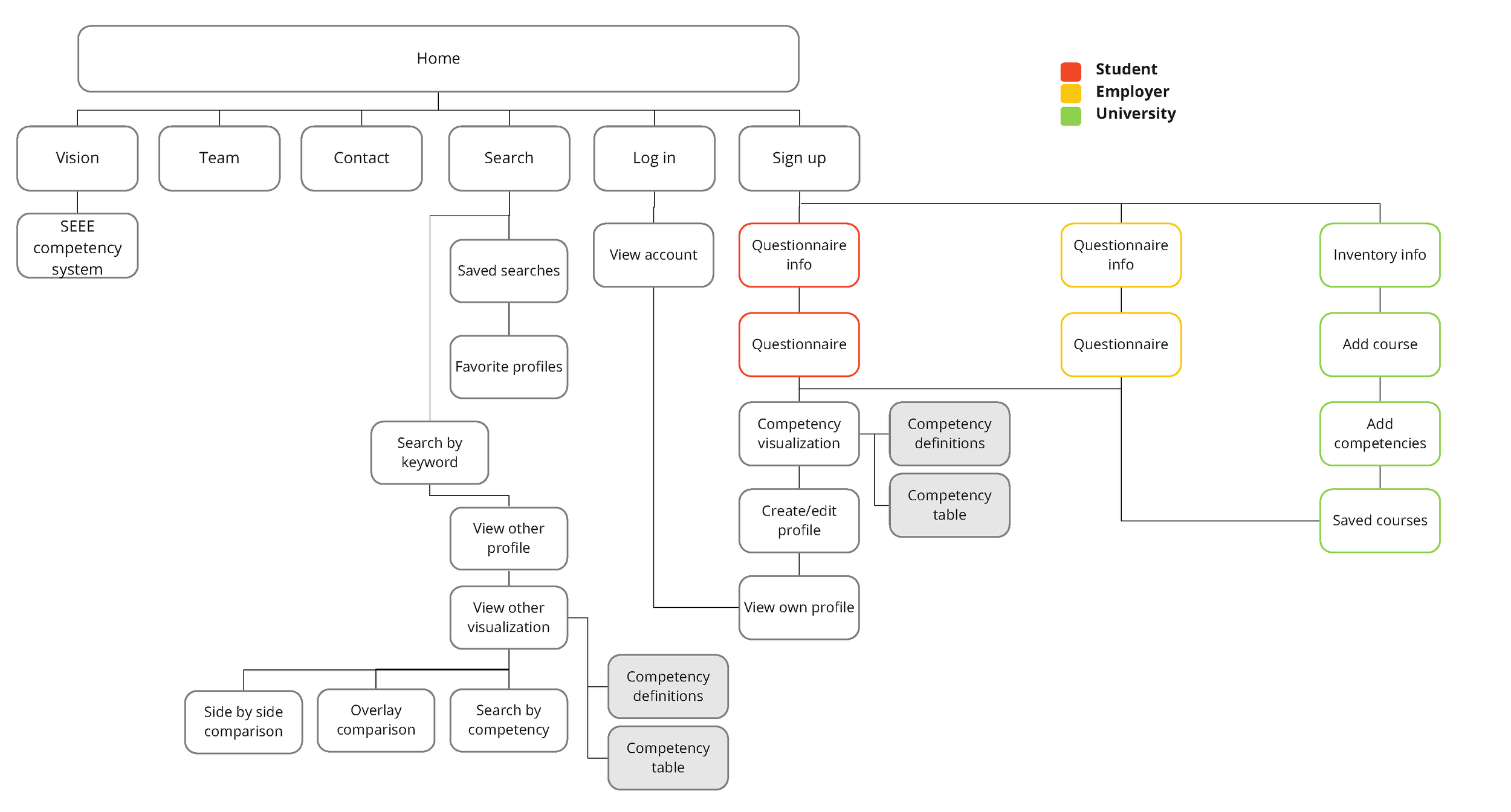
From here, I built two site maps based on stakeholder requirements. Testing was done via surveys that were conducted through Google Forms for our team of eighteen interdisciplinary students.
I quizzed the user to see which flow was more intuitive. I asked questions such as: “for Site Map 1, which series of tabs would you click on if you wanted to search through employee competencies?” and “for Site Map 2, which tabs require an existing account?”
Lesson: This survey was confusing to participants and I discovered it was a bit early to test out the site map in this format.
Site Map 1
Site Map 2
Design & Testing
I designed two sets of wireframes for each site map on Adobe XD to perform a A/B test.
I provided a task list to navigate through Site A and Site B and asked some questions to find out which site was more intuitive.
Site A
Site B
Quantitative results:
8/13 participants preferred Site A for Task 1 (profile creation).
9/13 participants preferred Site B for Task 2 (log in).
7/13 participants preferred Site B for Task 3 (static pages).
9/13 participants preferred a drop down menu.
Qualitative results:
“I like that when I logged in/created a profile, I was taken directly to the main parts of the site I would want to interact with”
“I think the drop downs need to be understood as such, they need more normative names, and can't just look like text, but I think they work better than having nav pages”
“It doesn't feel like you ‘have’ to sign up to see access the information.”
I used these insights to create a new flow of our website and changed some elements.
Lesson: In the future I will leave visual aesthetic out of testing to focus primarily on functionality.
Iterate
After testing and making new iterations of our website, I made a refined site map in Miro for the new developers who joined our team, as the previous one became outdated. They continued to use this site map in Miro as a task tracking resource.
Refined Site Map
Workshop
After further designing the website with the feedback I received on surveys, we got the chance to share a prototype with some potential users. I helped run a workshop of approximately 40 attendees, where we divided into breakout rooms of each user group (universities, employers, and student/practitioners). We used Miro as a visual aid to ask questions and record answers after each participant explored the prototype individually.
Workshop Screenshot
Analysis & Synthesis
We performed Affinity Analysis in Miro to organize our user responses into data we could use moving forward. We made categories, shown in purple, as we grouped similar responses together. This data helped us identify and address pain points. We considered all feedback, but only moved forward with what we all agreed was important and doable. One great takeaway we used from this session was privacy concerns, such as giving the user the option to keep some profile information private, like their full name.
Affinity Analysis
Designing for Accessibility
As the sole designer, I needed to make sure that accessibility was being incorporated into our website.
Here is a list of some of the guidelines I set for our team:
Use the WCAG contrast checker on all colors to check readability.
Use whocanuse.com to also check for color blindness.
Use both color and text to easily navigate content.
Use alt text on all images for text to speech.
Use form labels in addition to form placeholders for text to speech.
These guidelines would be used by rest of The Comcast Media and Technology Center going forward.
Retrospective
This was my first project where I was looked to as the sole designer on a team for a real life project. It is also my first project gaining experience of working directly with developers. This case study is just one portion of a lot of work I did to create this ecosystem. I am proud of the work I accomplished in Figma and it was much easier to use with my team than Adobe XD. I am also proud of leading my first live user testing session on Zoom.
It would have been useful to work with another designer, which usually did not happen. Even though I did user testing on a lot of design decisions, it is always helpful to have another person with different skill sets to develop content. Moving forward with the project, I worked with developers to help implement my design work into Sitefinity for the beta site. This was a learning process, as I would need to communicate important design decisions and provide alternative solutions when my designs were compromised after programming.


