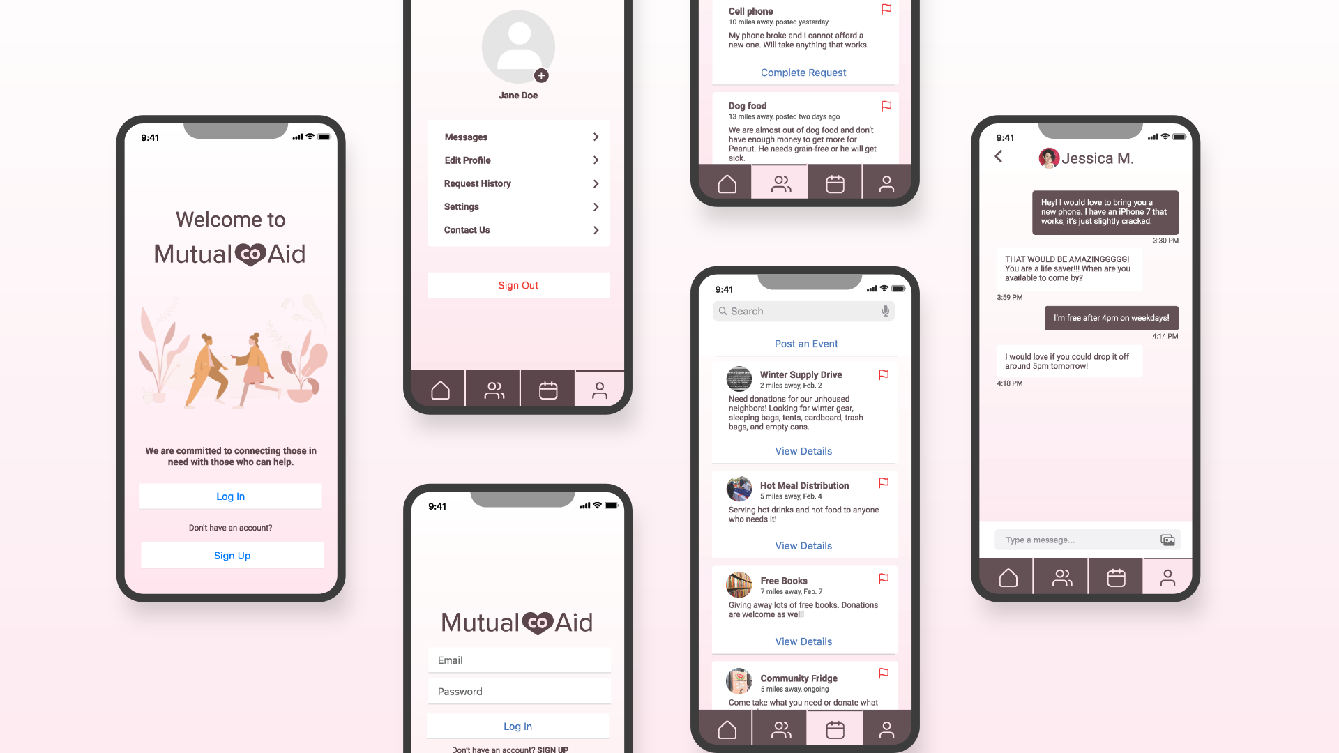
Design a responsive app that focuses on civic action.
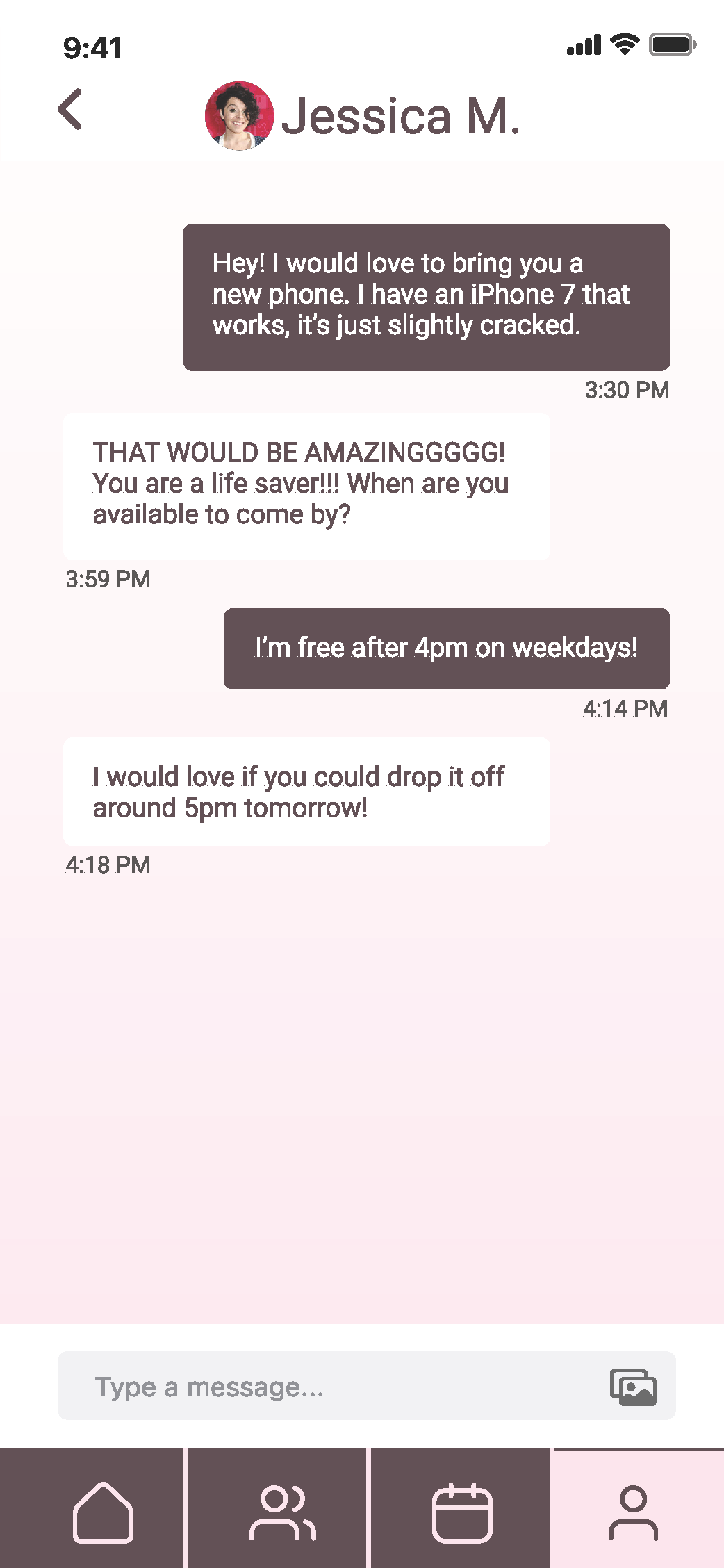
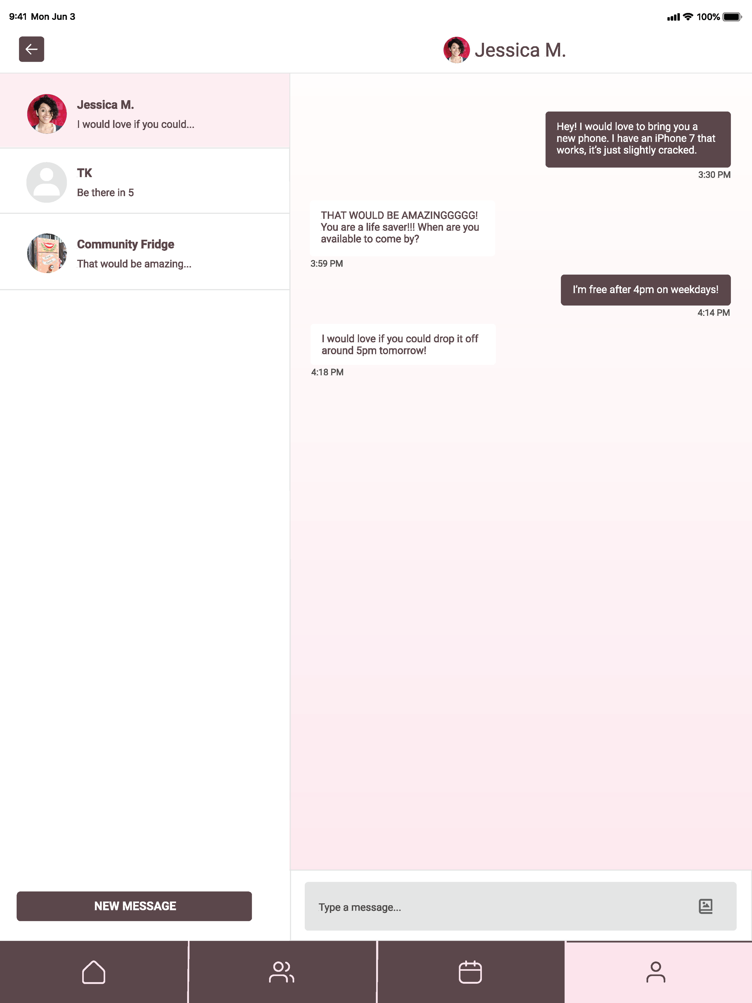
As the sole UX Designer for my class project, I was asked to create a responsive app for iOS mobile, tablet, and desktop. I designed a high fidelity prototype in Figma.
Overview
When I was asked to create a responsive app with civic action, I chose to focus on my community. This was during the time of the pandemic, where those who could give were so eager to help those in need. I wanted to provide a space that could be used by those who were in search of mutual aid and those who could fulfill mutual aid requests.
Project Proposal
It’s no secret that COVID-19 has left more people hungry, homeless, and jobless. Nearly 24 million adults — 11 percent of all adults in the country — reported that their household sometimes or often didn’t have enough to eat in the last seven days, according to Household Pulse Survey data collected January 6–18 (CBPP). An estimated 15.1 million adults living in rental housing —1 in 5 adult renters — were not caught up on rent, according to data collected January 6–18 (CBPP). Members of the community need a way to connect because they want to provide or receive mutual aid. Students began raising money at Colorado College and distributed nearly $37,000 but hopes to meet the more than $150,000 in requests already received (Colorado College). My app will not only include this mutual aid group, but all mutual aid groups in Colorado for easy access to provide and receive support in the community.
CBPP. (2021 Jan. 27). Tracking the COVID-19 Recession’s Effects on Food, Housing, and Employment Hardships. Retrieved from https://www.cbpp.org/research/poverty-and-inequality/tracking-the-covid-19-recessions-effects-on-food-housing-and
Colorado College. (2020 Dec. 1). Students Launch Mutual Aid Fund to Help One Another. Retrieved from https://www.coloradocollege.edu/newsevents/newsroom/students-launch-mutual-aid-fund-to-help-one-another.html#.YBLuLS9h3w5
Vision Statement
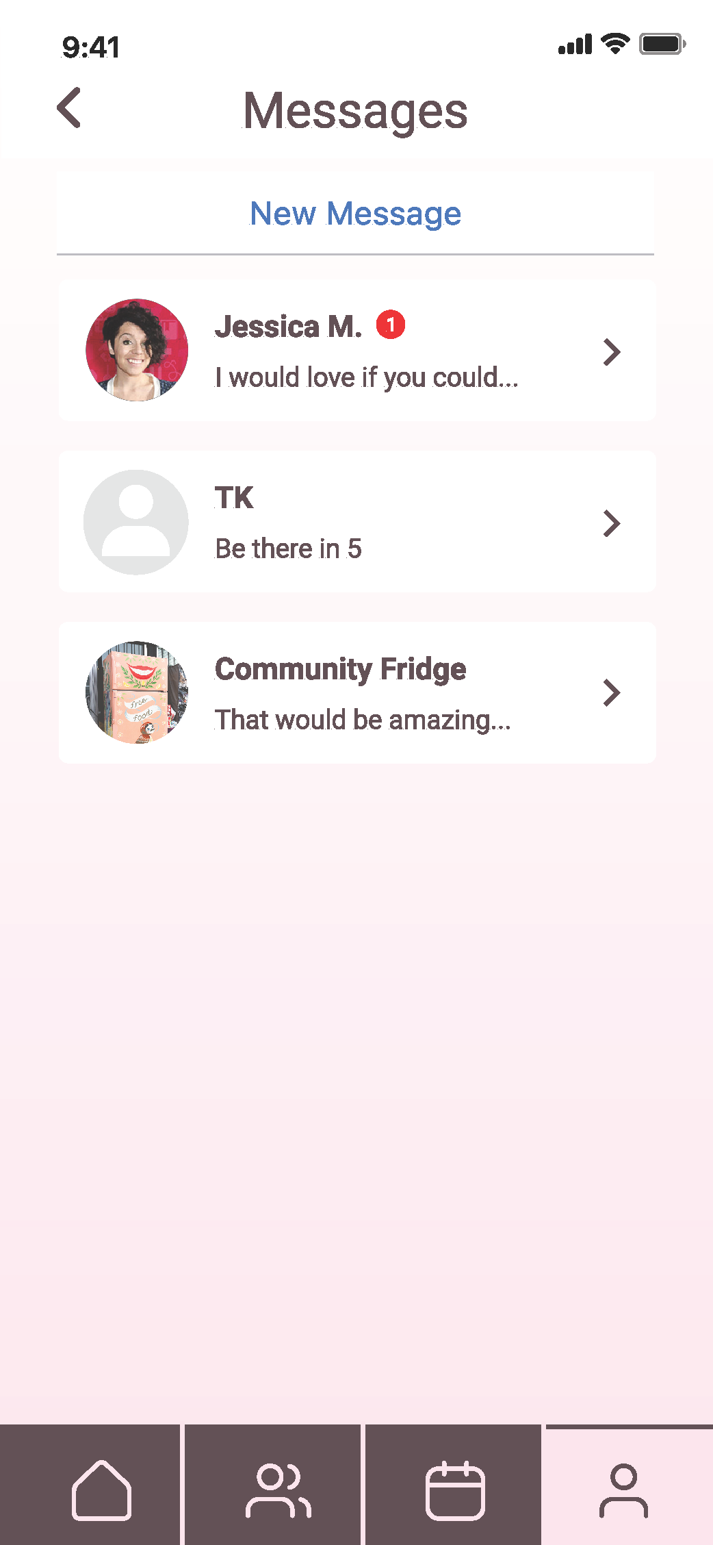
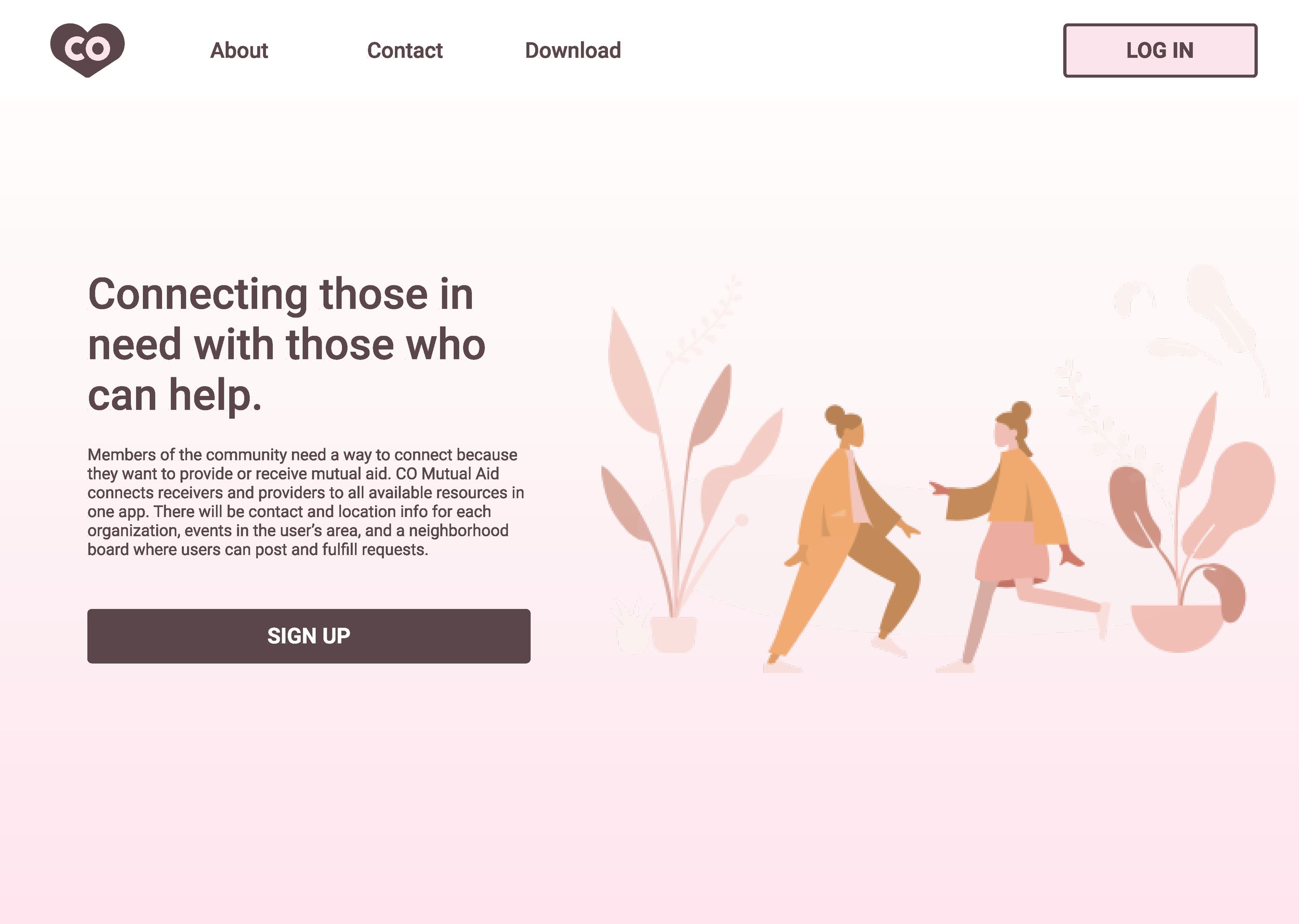
CO Mutual Aid will connect receivers and providers to all available resources in one app. There will be contact and location info for each organization, events in the user’s area and a neighborhood board where users can post and fulfill requests.
Circumstances of Use
Who: Individuals in need of mutual aid or who are in a position to provide mutual aid
What: Mutual aid can include any kind of donations- money, food, clothing, hygienic products, etc.
Where: Colorado
When: Someone loses a job, reduced work hours, gets evicted, loses their home, etc.
Why: More people are in need of basic survival items during the pandemic
Design Criteria
1. Simple Interface- The app will only feature necessary components and no extra frills. The receivers of aid need help quickly with no distractions.
2. Interactive Consistency- The app will need to be predictable for users to easily navigate a new app.
3. Expandable Components- There will be a lot of information in this app, so it’s important to display what is necessary and only show extra information with the users tap.
Success Metrics
Increase the amount of fulfilled mutual aid requests
Increase the number of users giving and receiving aid
Decrease the amount of time it takes to complete a request
Project Approach
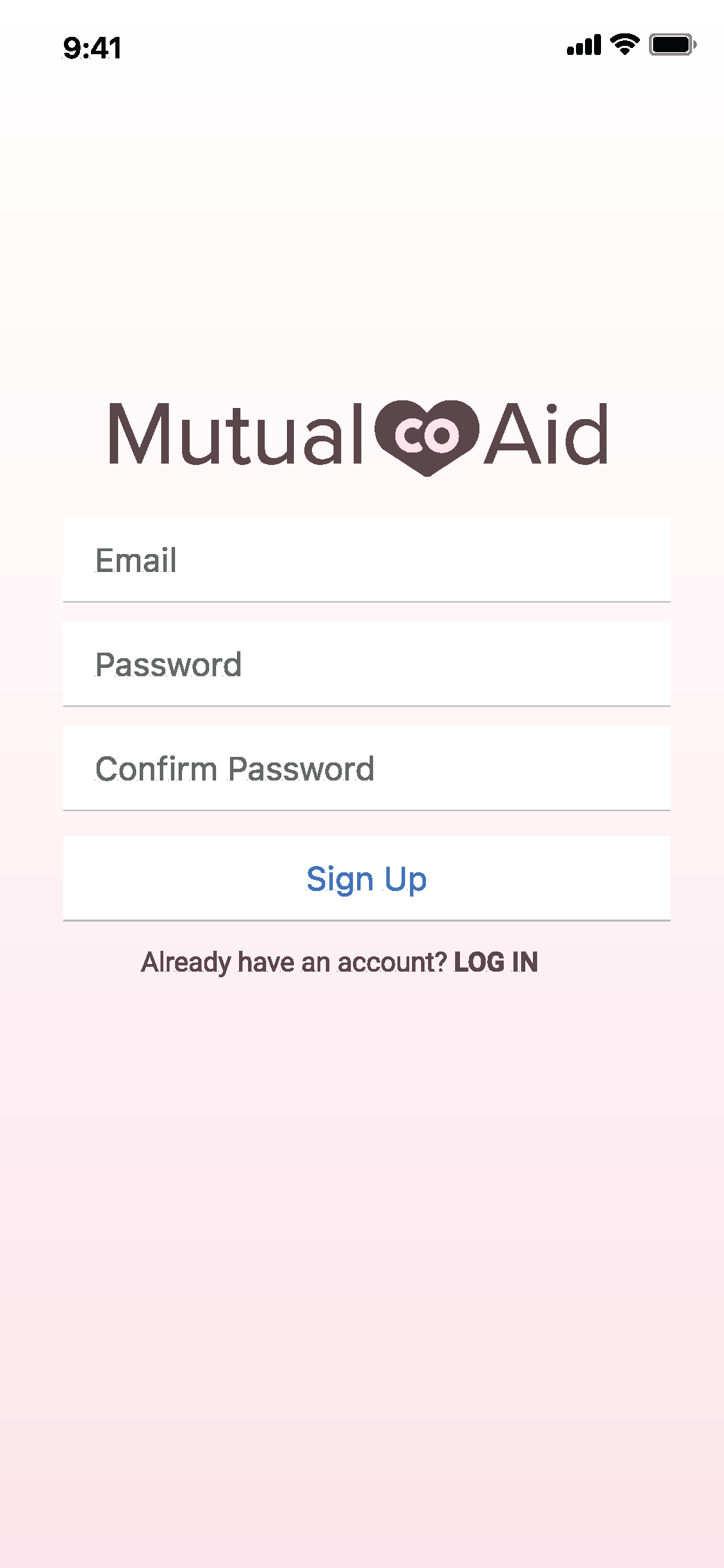
The visual research I completed included sketches, a flow chart, and a competitive analysis. After I completed my research, I began creating my mobile screens in Figma. I revised my initial designs after I got some feedback from other students and my professor. Then, I finished making screens for my other devices.
Low Fidelity Sketches
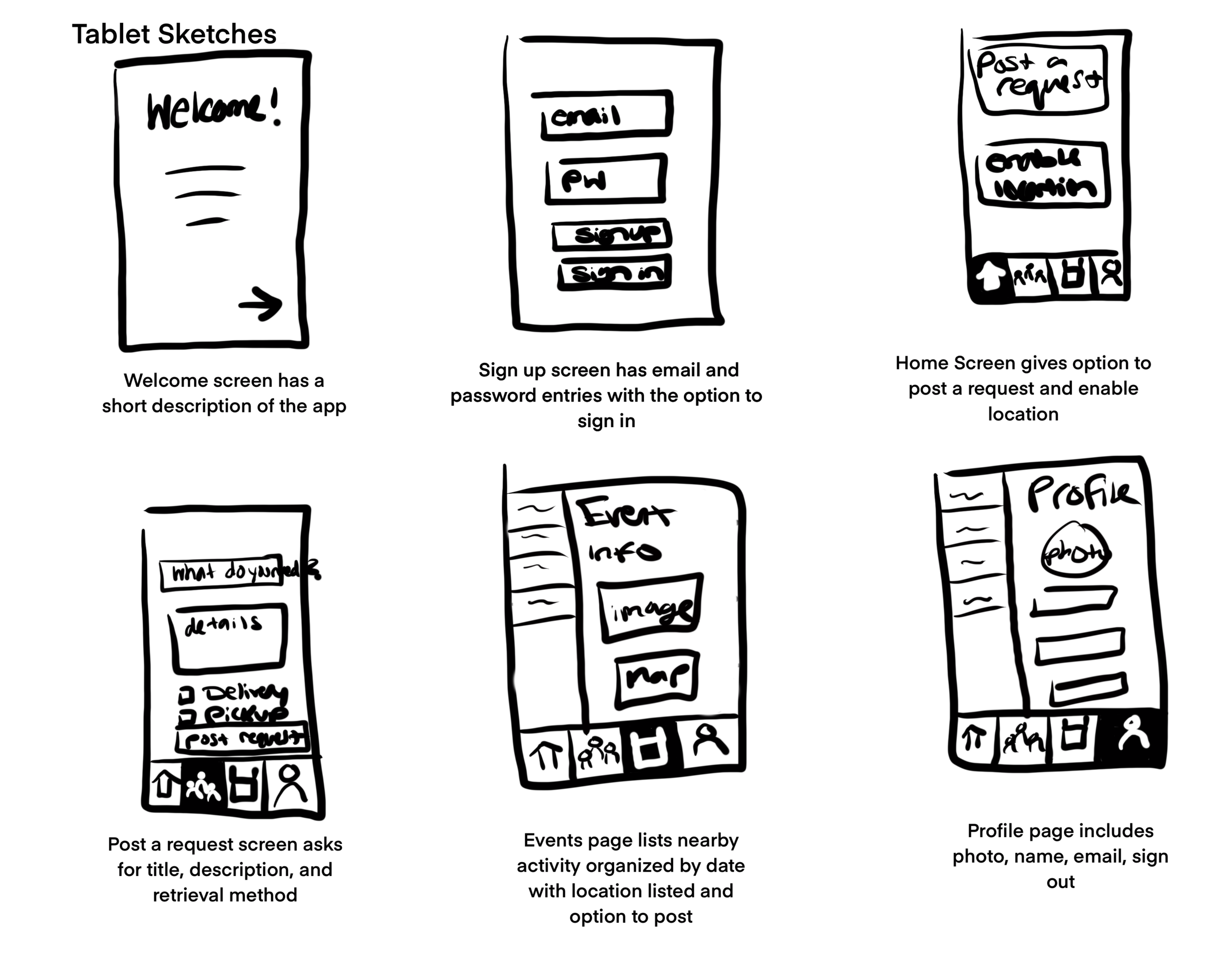
First, I sketched how each screen would look among different devices, so I could visualize how to organize necessary information. I did this same exercise for each device.
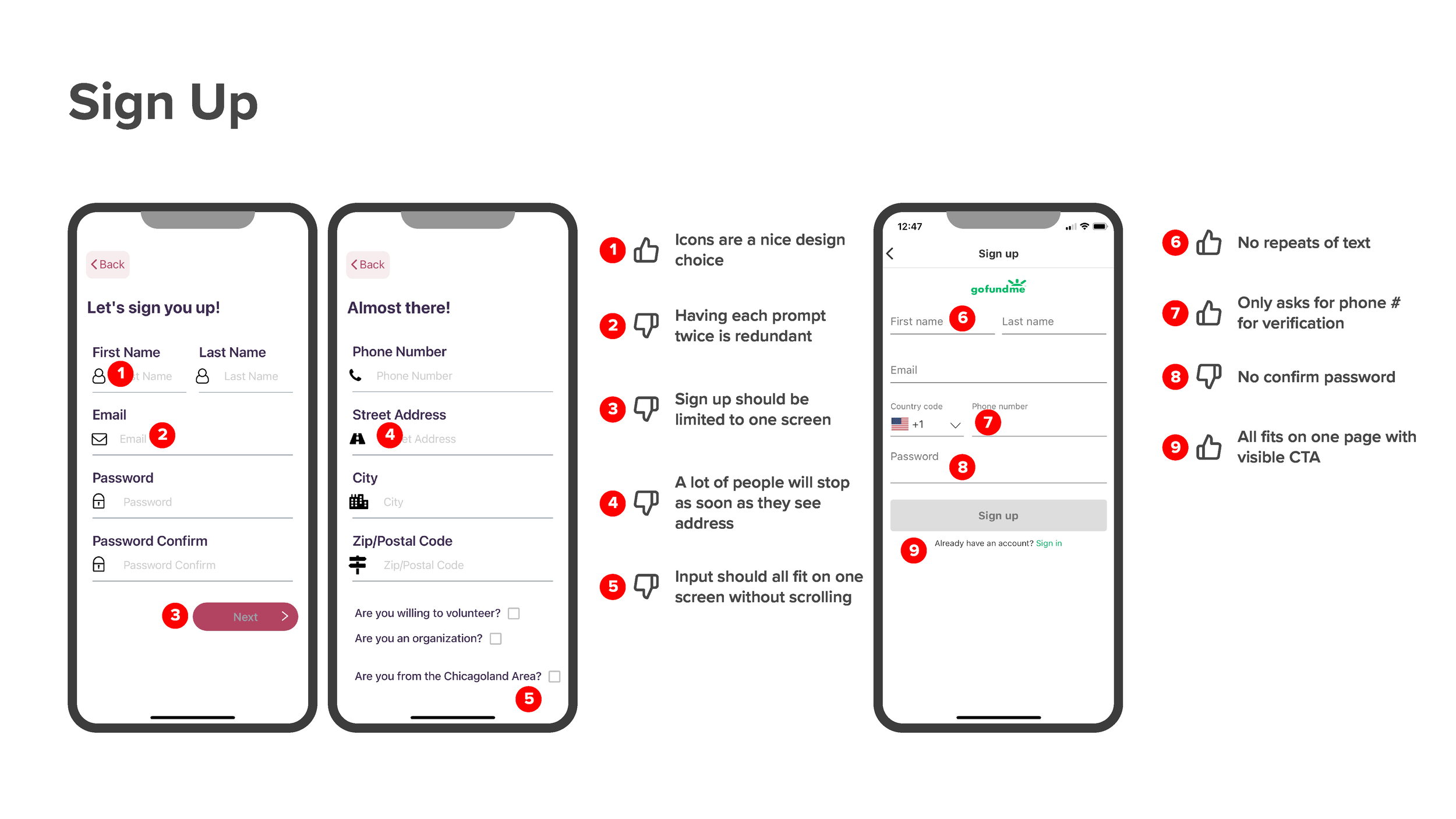
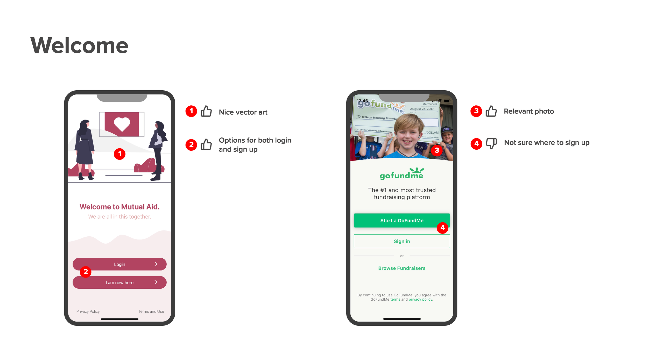
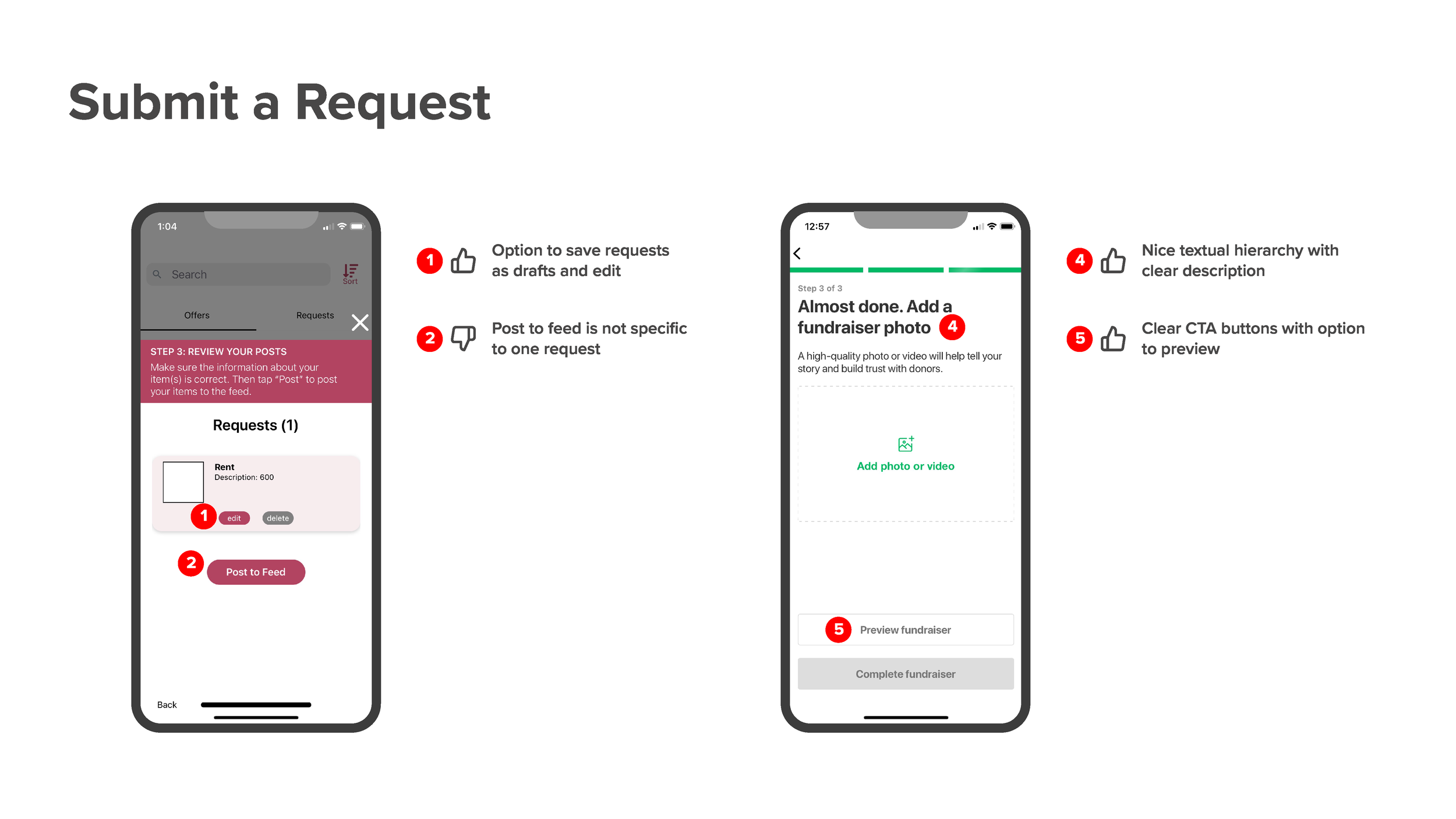
Competitive Analysis
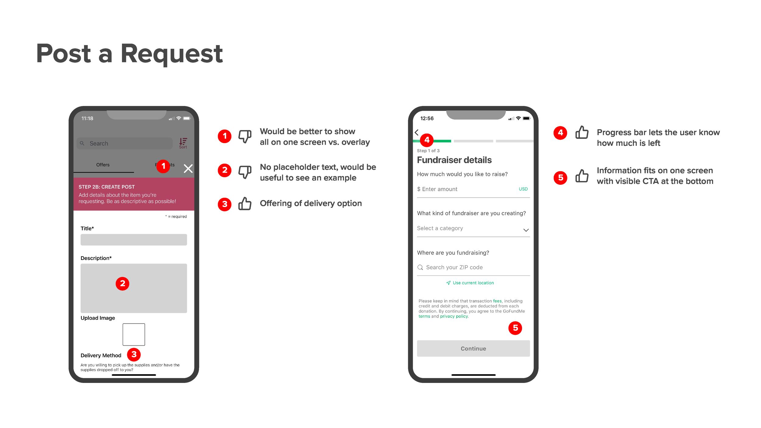
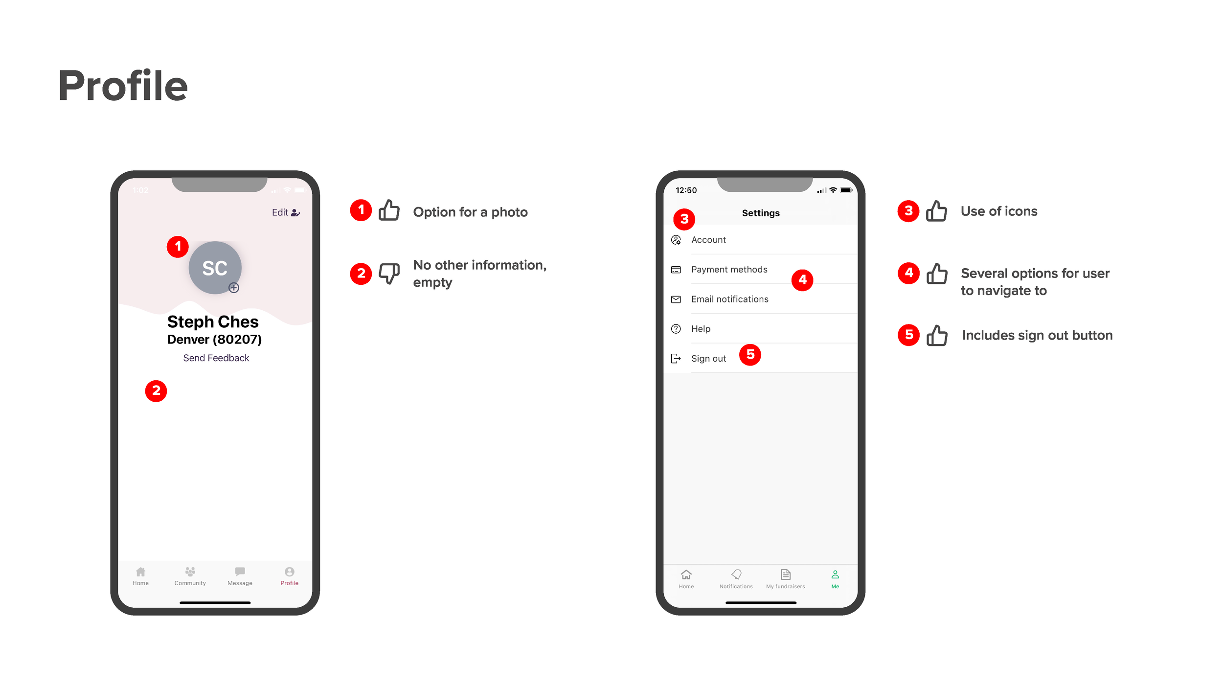
First, I sketched how each screen would look among different devices so I could visualize how to organize necessary information. Next, I created a flow chart in Axure so I could see how the user would navigate through the app. Lastly, I completed a competitive analysis so I could compare how similar apps function and I highlighted what worked well and what could use improvement. The apps I chose were Mutual Aid and GoFundMe.

Flow Chart
Next, I created a flow chart in Axure so I could see how the user would navigate through the app. This included options for how the user would respond in each screen.
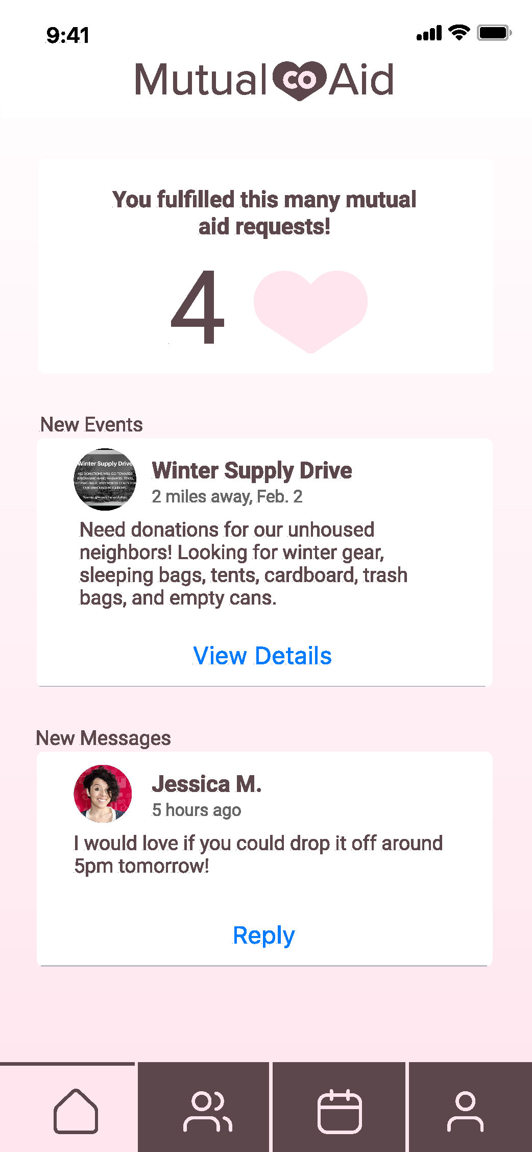
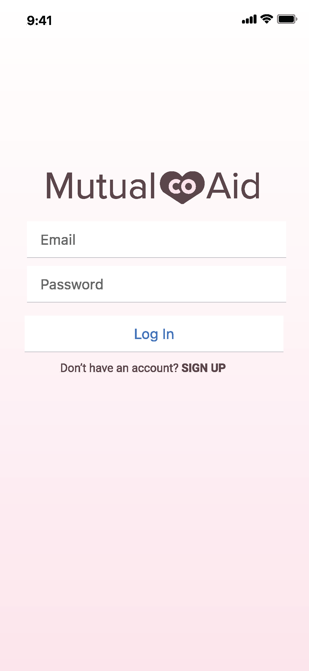
Mobile Screens
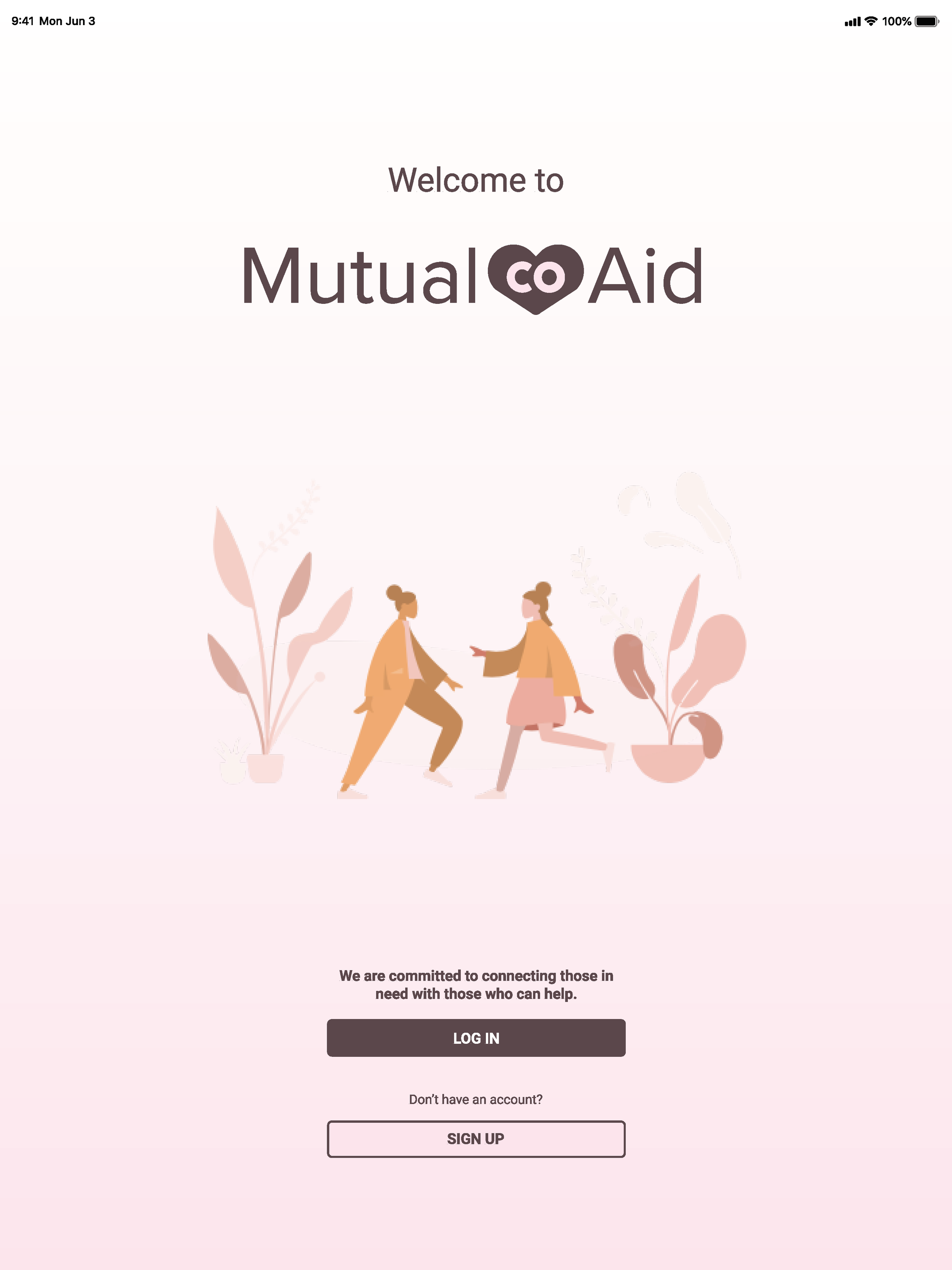
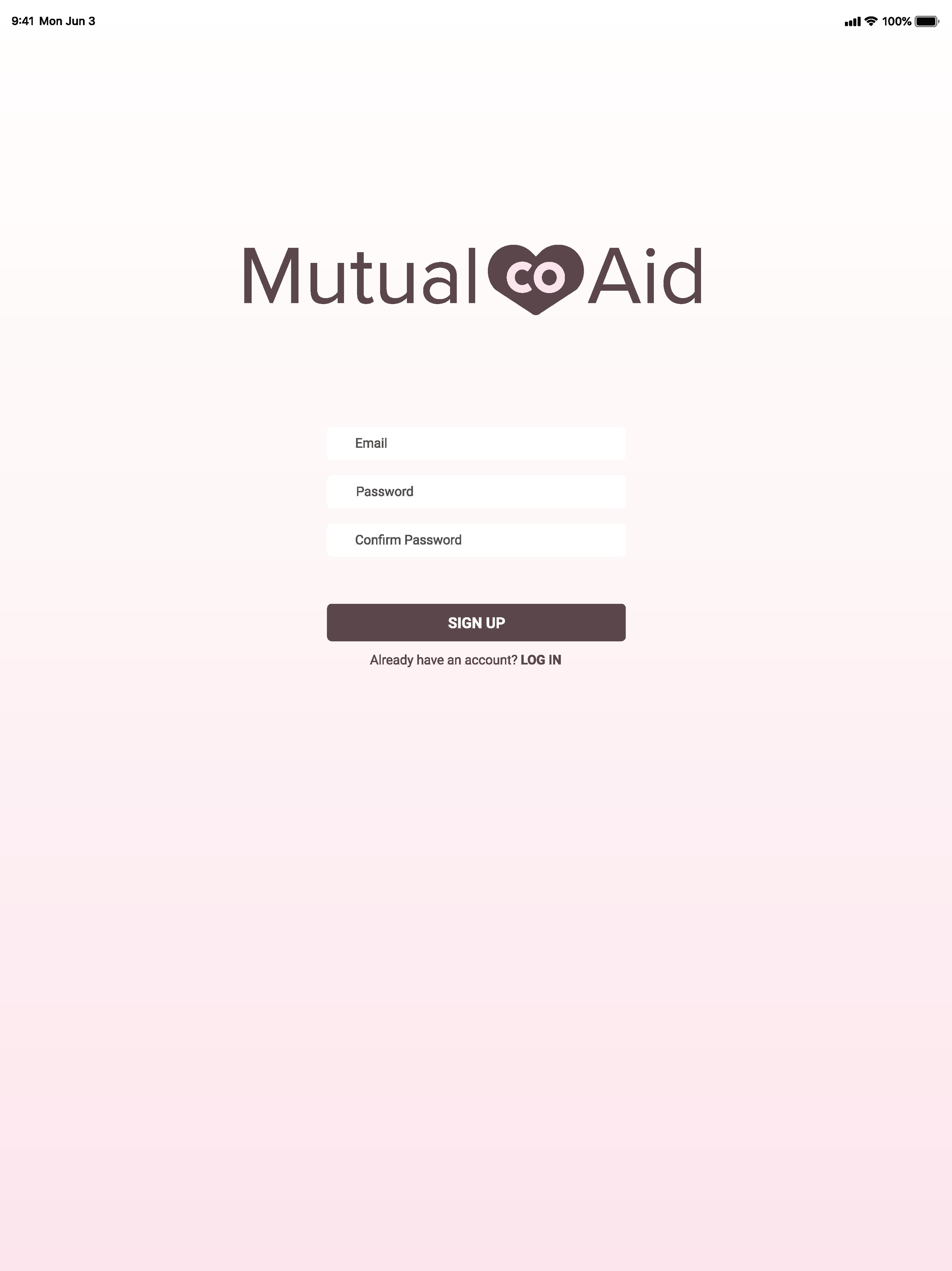
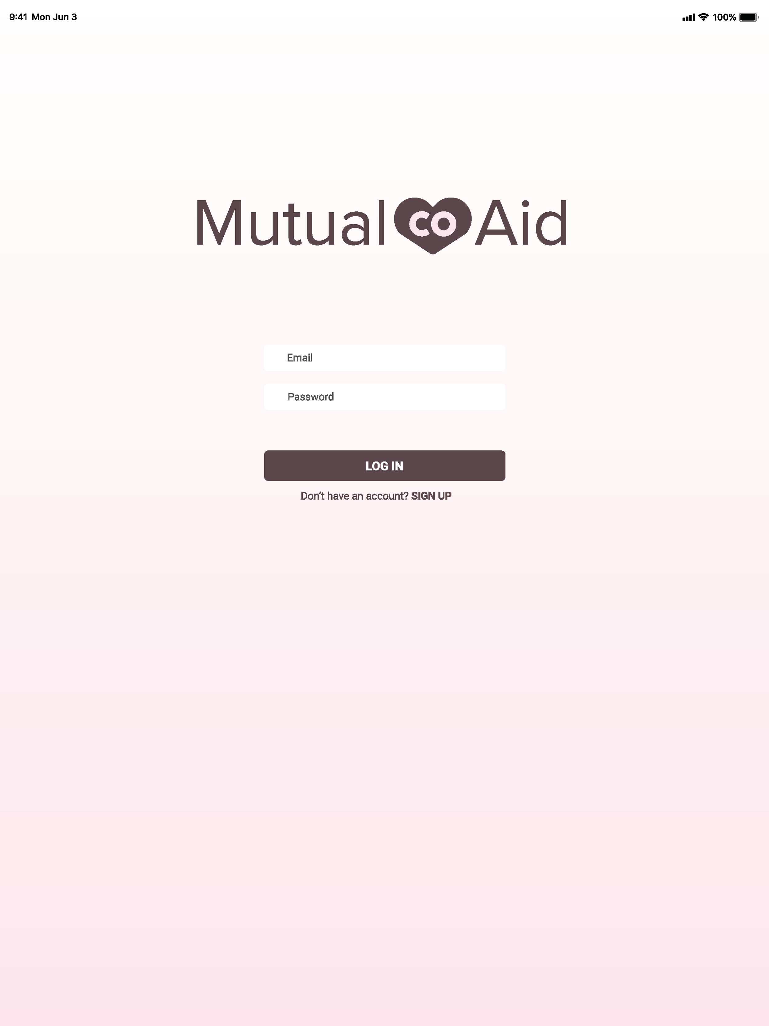
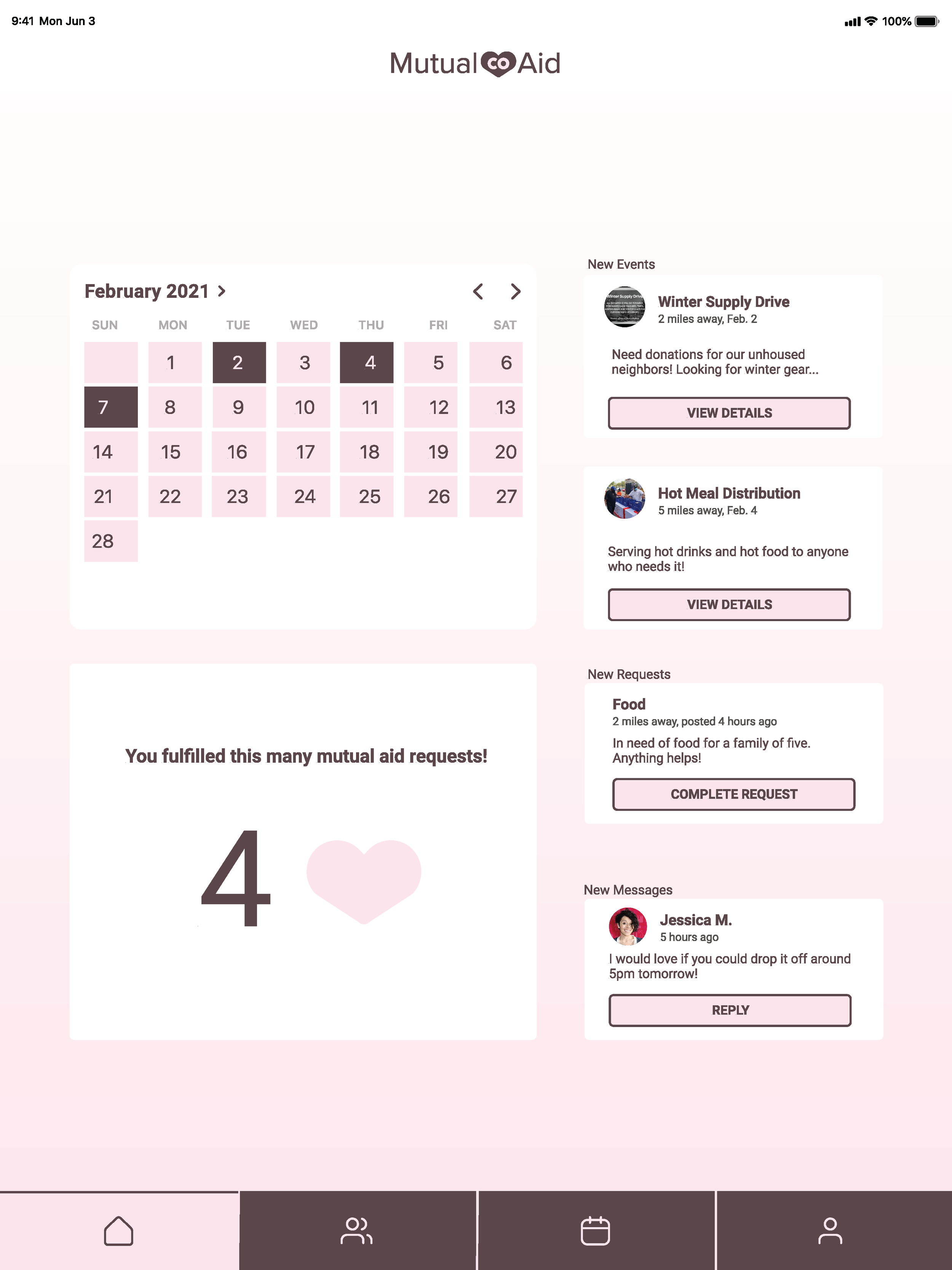
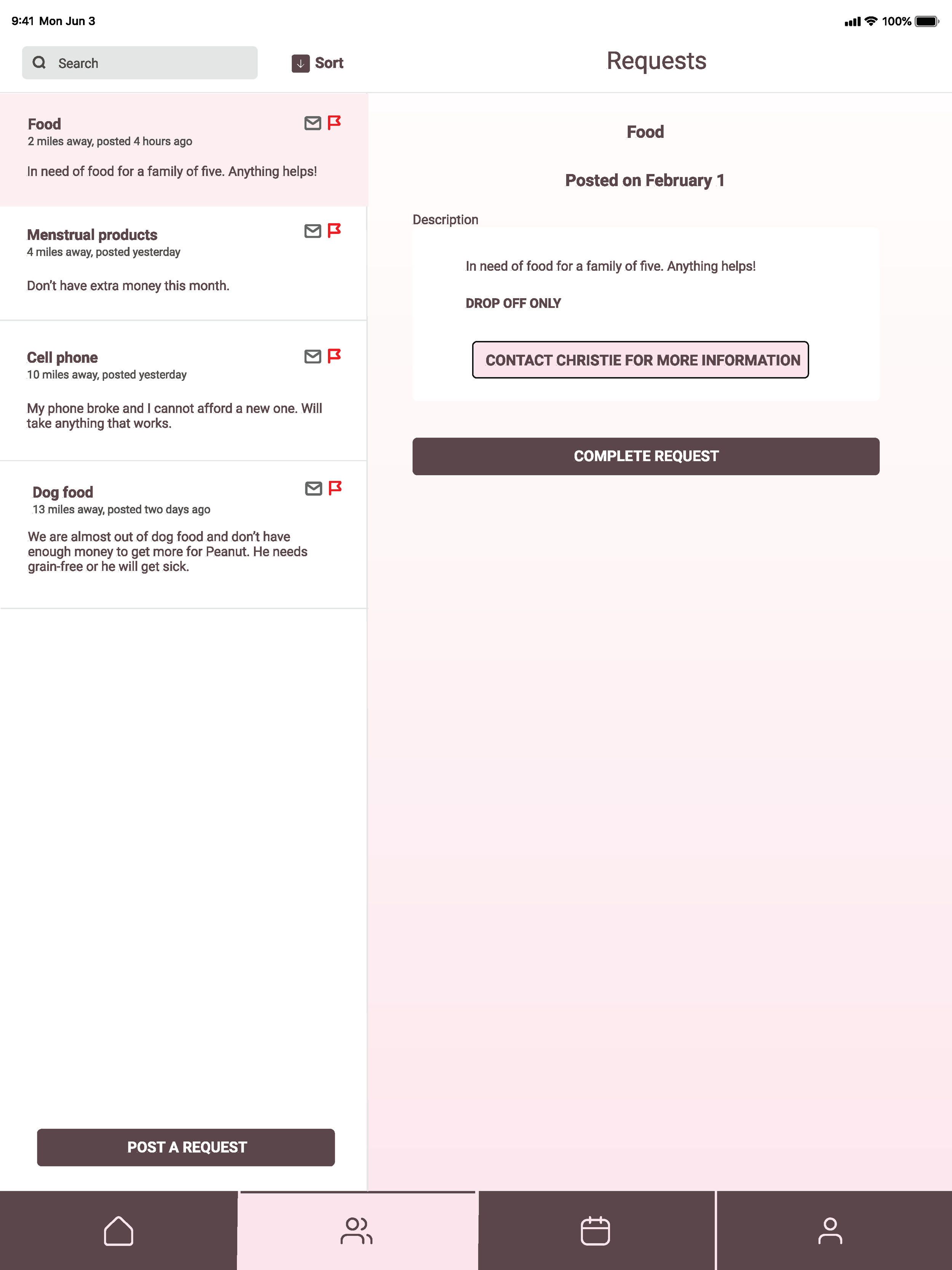
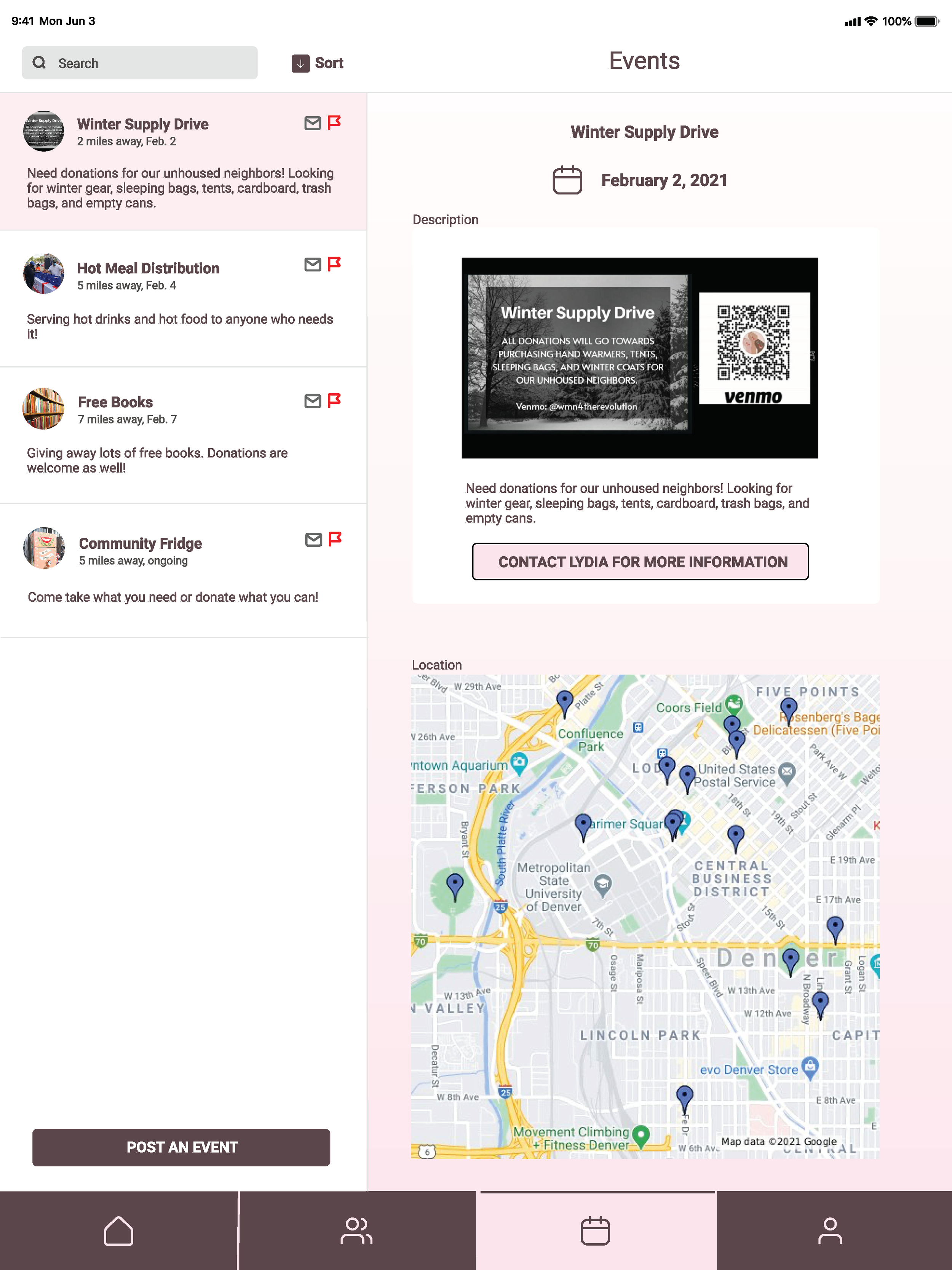
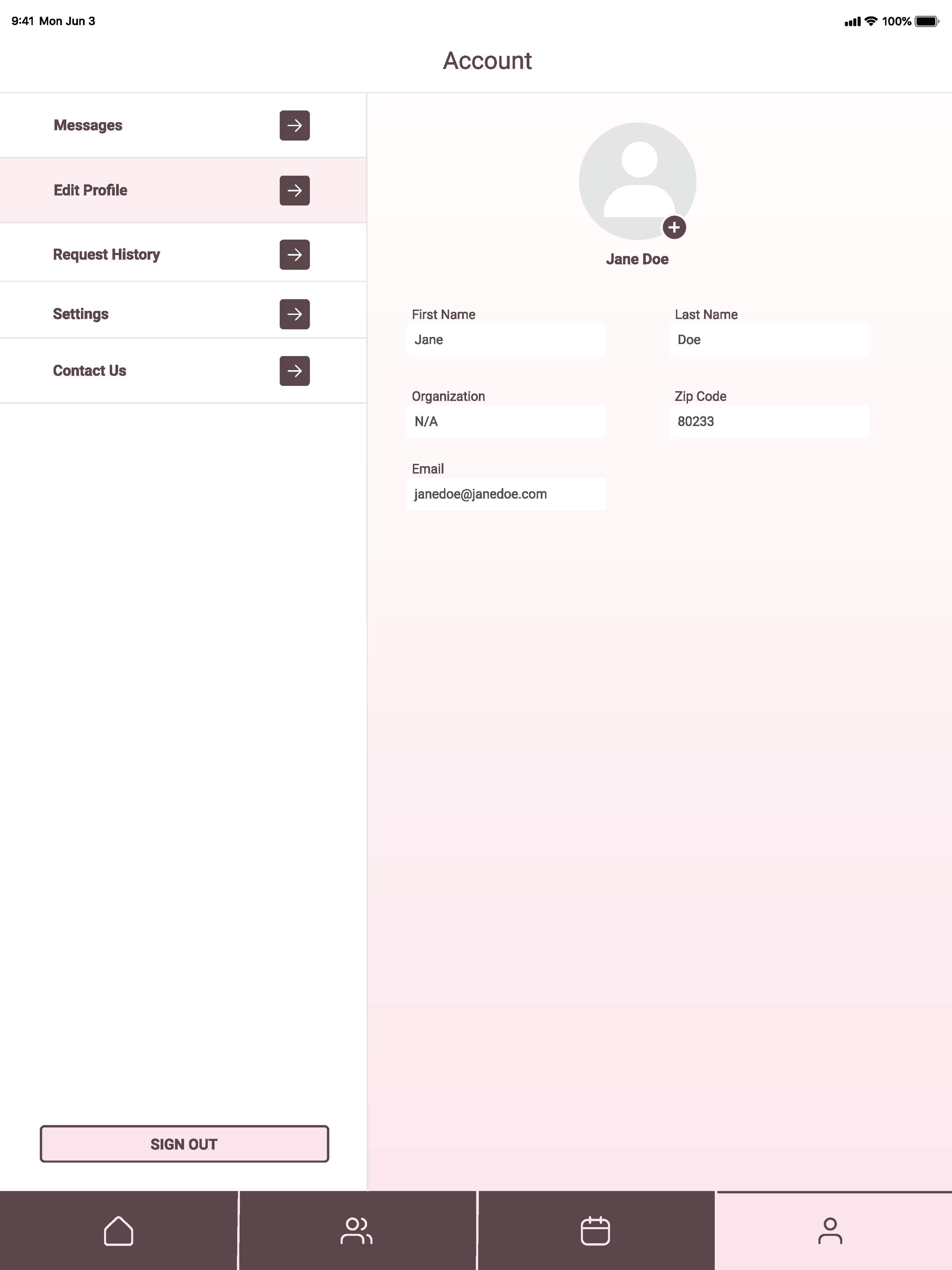
Tablet Screens
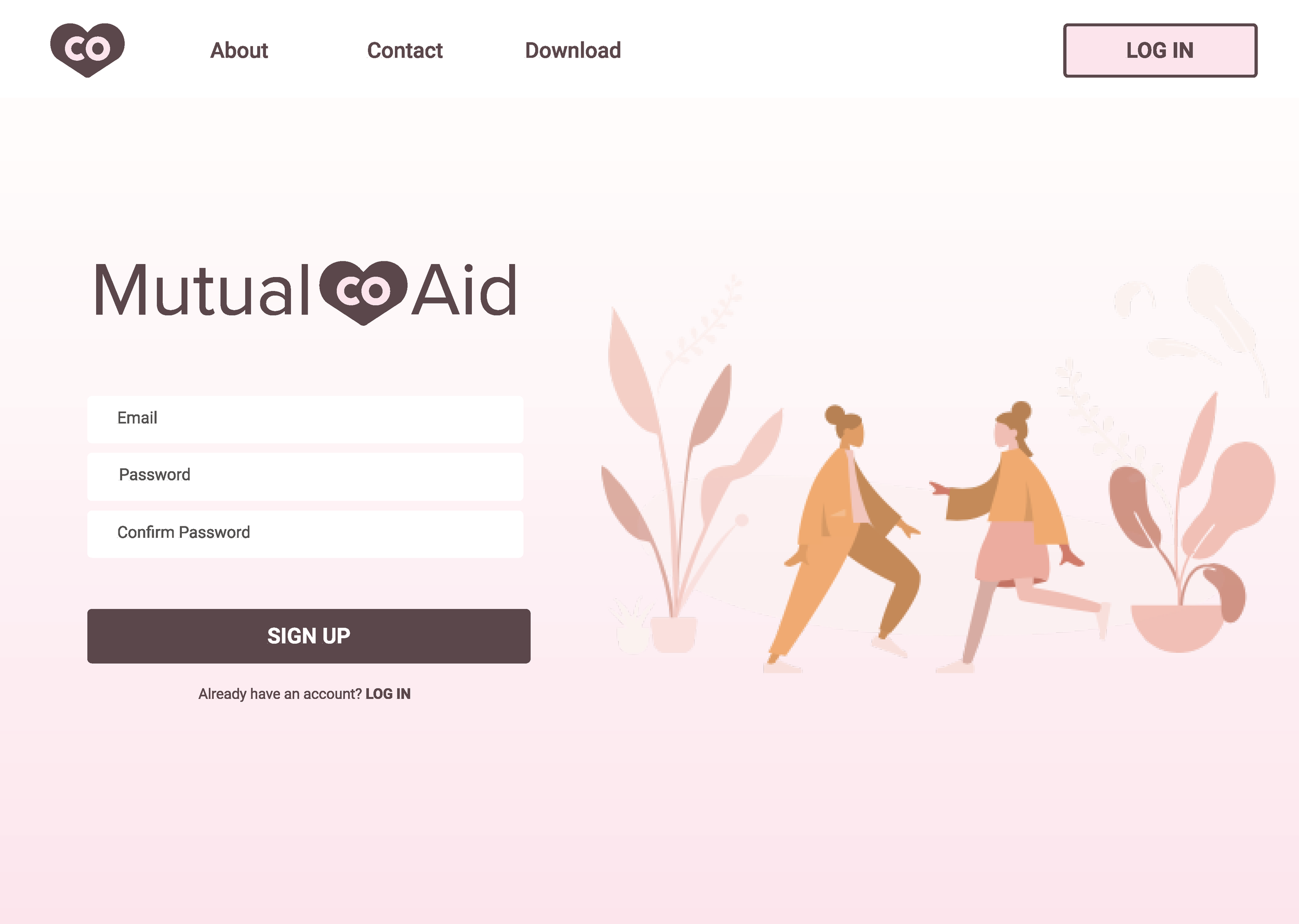
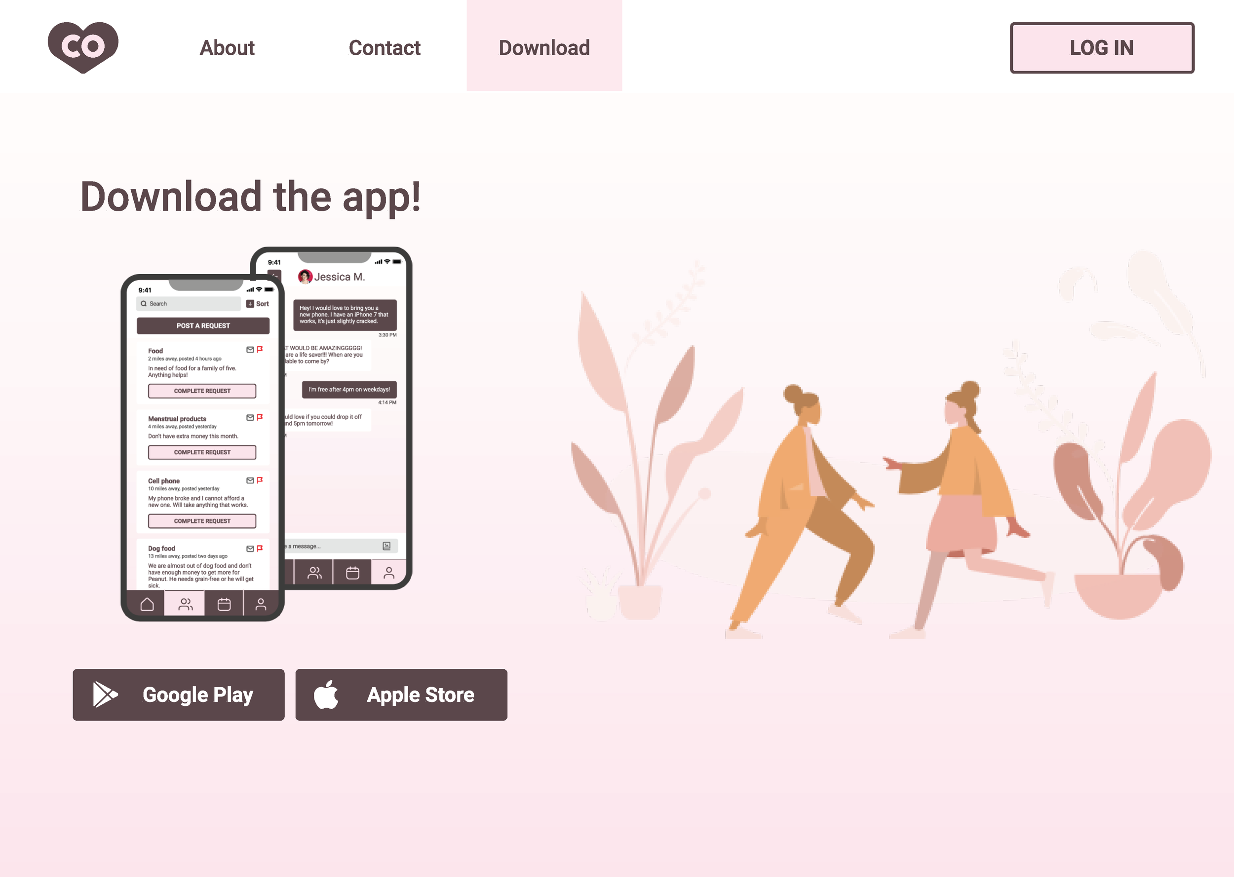
Desktop Screens
Design Feedback
I received feedback from my fellow students and professor via online discussions. The first online discussion was for our rough sketches. I asked for feedback on what I should include on my Home Screen. Some responses included suggestions of gamification and using a calendar.
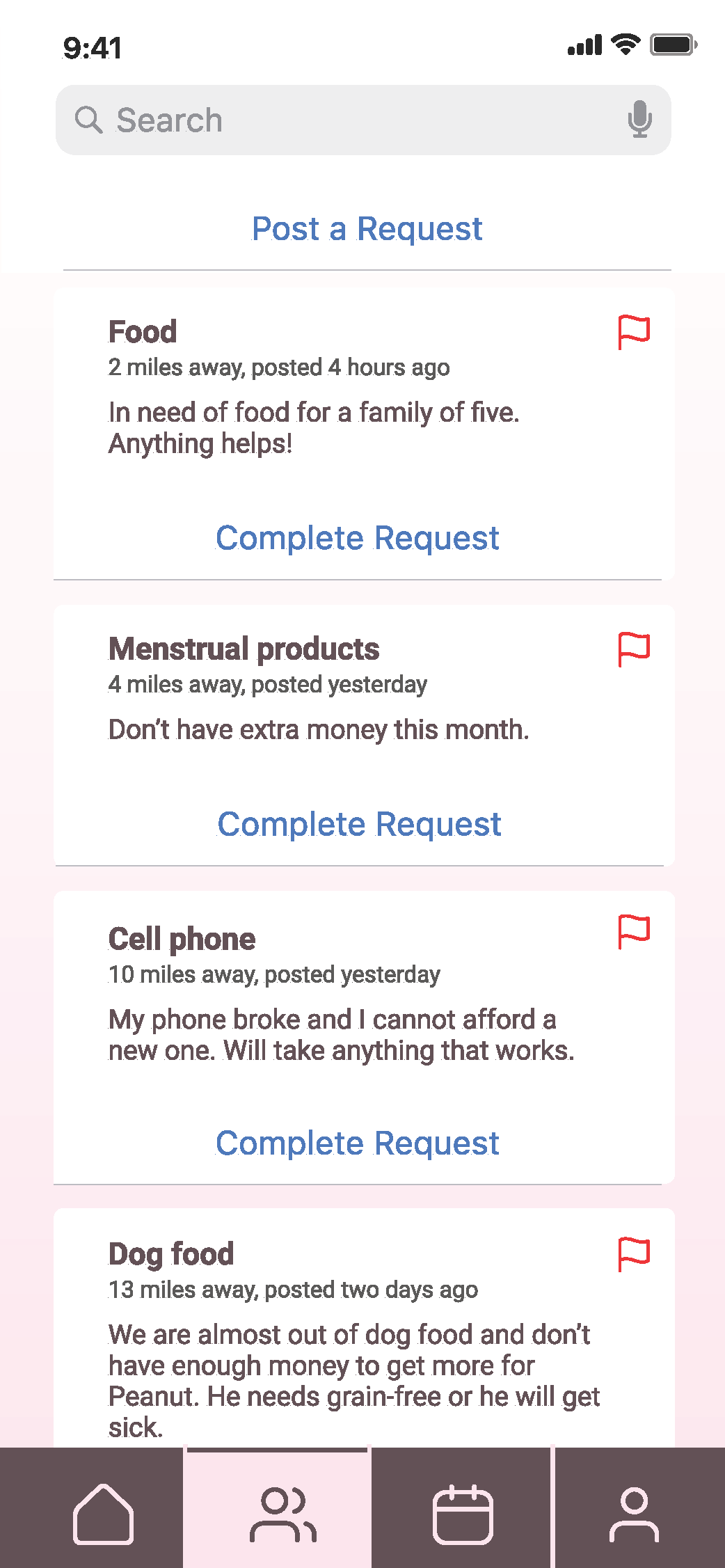
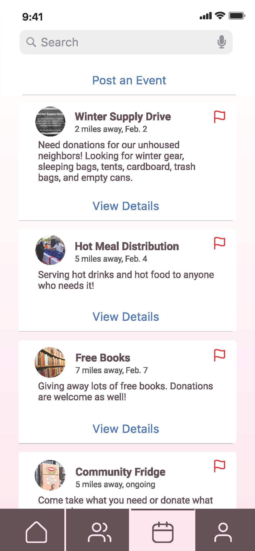
The second discussion was for our mobile screen designs. Some feedback I got was that my Requests and Events screens were too similar and that I should include more space for the user to include descriptions and images. I was also told that my Home Screen was duplicating navigation by including links to places that were already in the tab bar.
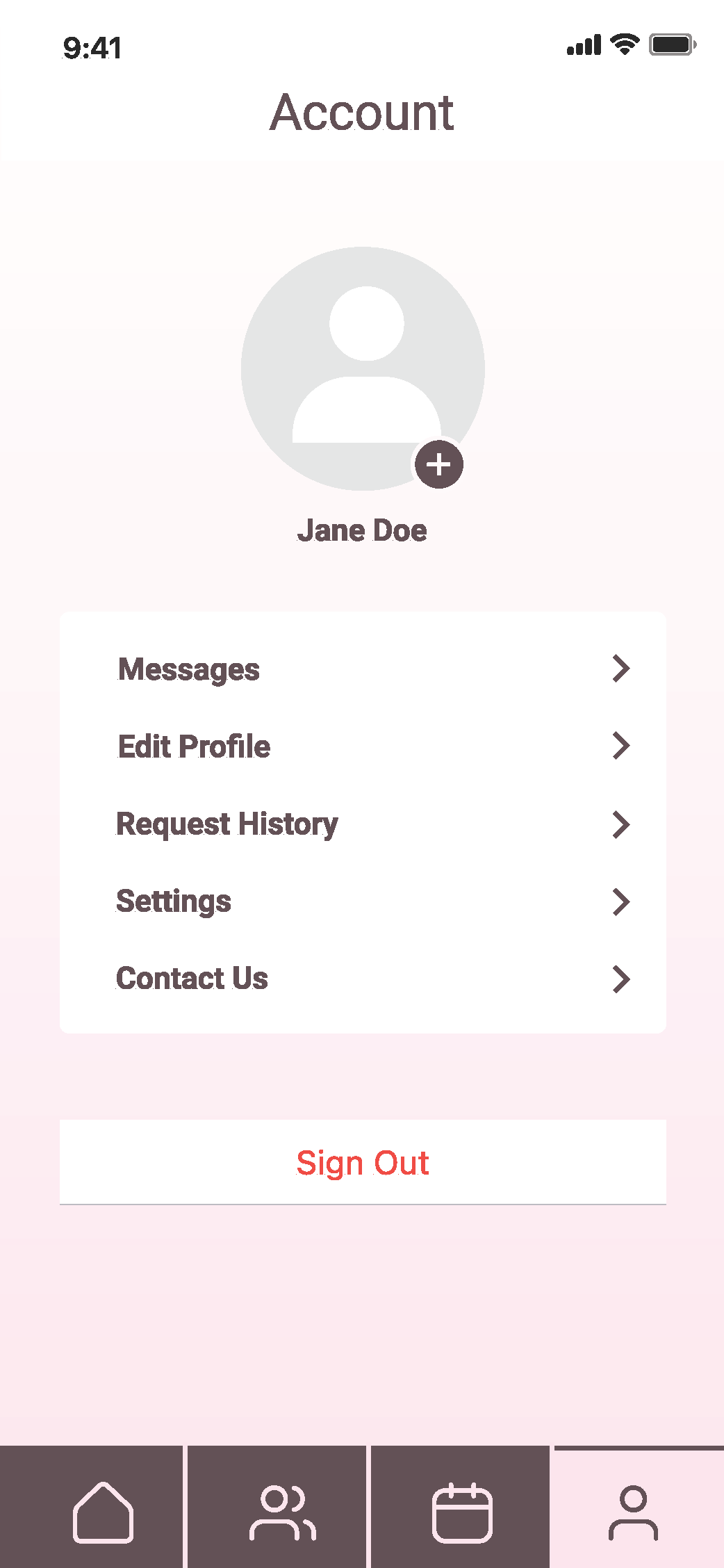
I revised my designs based on this feedback. As you can see in my final screens, I included a calendar and completed requests counter on the iPad and desktop versions where there was more space. I also added user imagery for the events page and changed my Home Screen so it was less repetitive.
Prototype Walkthrough
Retrospective
The most challenging part of this project was becoming acquainted with Figma. I had to complete a lot of work and using a new program for it was time consuming, but I came out of the project with a lot of experience.
I am most proud of designing cohesive designs that work across multiple devices. This was my first time designing for multiple devices, so I had to really think about what the user would want to see and use on each device.
I went back later and revised the mobile screen designs, as they were not using the iOS UI components.


